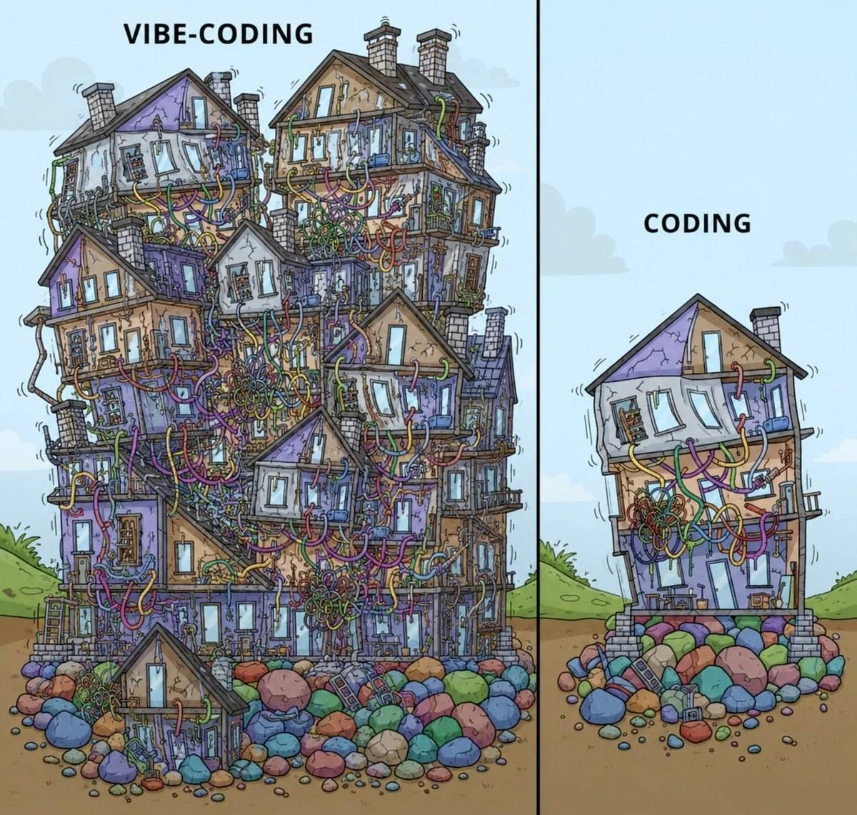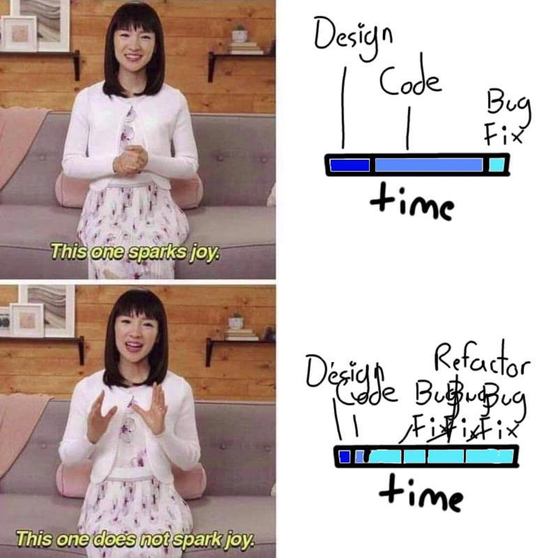
When the neat architecture diagram meets the real-world cable spaghetti
Why is this DesignPatterns Architecture meme funny?
Level 1: Expectations vs Reality
Imagine you draw a simple plan for hanging up holiday lights in your room. On paper, you sketch three straight lines of lights, nice and tidy, and it looks perfect – that’s your expectation. But when you actually start hanging the lights, things get tricky. The cords get twisted and snagged on furniture, you plug in a new string of lights here and there, and soon the wires are crisscrossing everywhere. Instead of three neat lines, you have a big tangle of cords in the corner. It’s a bit of a mess, even though the lights do turn on. This is exactly what the meme is joking about: the difference between a neat plan and the messy reality that often happens. The left picture with the clean wires is like your tidy light-hanging plan, and the right picture with the giant knot of cables is what it ended up looking like after dealing with real life. It’s funny because we’ve all experienced something like this – whether it’s tangled headphones, Christmas lights, or even just trying to neatly arrange our desk cables. We start with a nice idea of how organized it will be, but reality has a way of messing it up. The meme makes us laugh and nod, because it’s showing that in engineering (and in everyday life), things usually don’t stay as perfectly organized as we hoped!
Level 2: Tidy to Tangled
At its heart, this meme is contrasting design ideals with real-world complexity. Let’s break down the terminology and imagery for a newer developer or someone learning about system design:
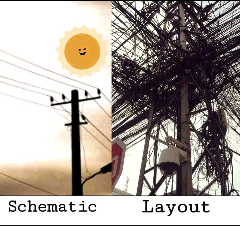
Architecture diagram (Schematic) – This is the left image labeled "Schematic". In software, an architecture diagram is a simplified drawing of how a system is supposed to be organized. It might show different modules, services, or layers and how they connect, usually with neat lines or arrows. Think of it like a blueprint for a building, but for software structure. In the meme, the schematic has just three clean, parallel wires on a telephone pole with a happy sun watching over – it represents a simple, orderly plan. In coding terms, this is like when you plan out a program with clear sections or follow a textbook design pattern (like Model-View-Controller) where each part has a defined role and connections between parts are straightforward. Good code quality often starts with such diagrams – everything well-structured and easy to follow.
Actual implementation (Layout) – The right side labeled "Layout" shows an actual telephone pole in the real world, and it’s overloaded with a jungle of wires going in all directions. This represents what can happen to that clean plan once the system is actually built and modified over time. In programming, the "layout" is the code or infrastructure as it exists in production. Here, it’s full of hidden complexity – all those extra cables are like features, fixes, or improvements that were added on later in an uncoordinated way. The neat plan didn’t survive; reality got messy. This often happens in projects: the final code has a lot more going on than the initial diagram anticipated.
Spaghetti code – This is a key term the meme hints at by showing “cable spaghetti.” Spaghetti code is a slang term for code that is tangled and twisted in logic, just like a plate of spaghetti. Instead of a clear flow, the code jumps around via many interconnected paths, making it hard to untangle and understand. For example, imagine a program where function A calls B, B calls C, C calls A again, and there are global variables and side effects everywhere – that chaotic structure is spaghetti code. The telephone pole with knotted wires is a perfect analogy: just as it’s hard to trace one wire in that knot, it’s hard to follow the flow of spaghetti code. This usually arises from lack of structure or careless additions over time.
Technical debt – You can think of this like shortcuts or “IOUs” in code. When a team is under pressure, they might do something the quick-and-dirty way rather than the clean way. This creates technical debt: an obligation to fix it properly later. If you don’t “pay off” that debt by refactoring or improving the code, the problems compound – just like interest on financial debt. In the meme, each extra wire could symbolize a bit of technical debt – an easy fix added quickly. One wire isn’t too bad, but if you keep doing that, you end up with the giant tangle we see. It’s much harder to address later. New developers often hear this term because managing technical debt is crucial for long-term code quality.
Design vs. implementation gap – This phrase refers to the difference between how we intended to build something and how it actually turned out. Beginners learn idealized patterns and might assume production systems look like the neat diagrams in tutorials. The meme gently jokes that in reality, things can be far messier. The "gap" is all those unexpected complications and deviations that happened along the way. Understanding this gap is important: it teaches that documentation and reality might not match after a project has been through many real-world demands. This is why continuous architecture review and documentation updates are needed — otherwise, your diagram becomes fiction while the code lives its own life.
Architecture tradeoffs – When designing a system, engineers make architecture decisions and tradeoffs. For instance, you might choose a simple design that’s easy to understand (few wires), but perhaps it’s not super flexible. Or you allow more flexibility and quick additions (just add a wire when needed), but that can sacrifice clarity. Over time, those tradeoffs determine whether you end up closer to the left image or the right image. If you always prioritize speed of adding features over maintaining structure, you accumulate mess (speed now = debt later). On the other hand, spending a lot of time to keep things tidy is an investment. Real projects balance these tradeoffs based on deadlines, resources, and priorities. Overengineering is when you spend too much effort making the design overly complex upfront (which can be its own problem), whereas under-engineering (or neglecting design) can lead to the spaghetti situation. The sweet spot is hard to find, and the meme humorously shows what happens when the balance tips too far toward quick-and-dirty fixes.
To connect this with a common experience: imagine you start a small coding project or even organizing files on your computer. At first, you have a neat plan (like a clear folder structure or clean code modules). As you add more stuff without reorganizing, things might end up in odd places, or you have to patch something quickly to make it work. Before you know it, that project or folder structure is a bit messy – not at all like your original plan. In a professional software project, the same thing happens on a larger scale. The left side is the initial neat plan; the right side is after a few years of real-world complexity and haphazard growth.
The telephone pole metaphor is great because even non-programmers know what messy wiring looks like. In some cities, you literally see telephone or power poles with an insane amount of cables zigzagging – a result of many years of additions and quick fixes. In software, you don’t see the mess so visibly, but trust me, it’s there in the code and system diagrams. This meme just makes that invisible code smell (a sign of poor structure) visible in a hilarious, exaggerated way. As a newcomer, the key lesson is: always be aware that maintaining a clean architecture is an ongoing effort. It’s easy for any project to turn into “cable spaghetti” if the team isn’t careful about managing changes and tech debt.
Level 3: Big Ball of Mud
Every seasoned developer has lived this meme. On the left, the “Schematic” side is that shiny architecture diagram you might see in a design review or in the project documentation. It has three tidy parallel wires under a bright, winking sun – everything is orderly and optimistic, much like the diagrams we draw on a whiteboard when starting a new system. Perhaps it represents a classic 3-tier architecture or a microservices layout with clear-cut boundaries. The lines are straight, and the boundaries between components are respected. This is the promise of good architecture: simple interfaces, well-defined layers, and no messy overlaps.
Then reality hits – the right side “Layout” is what the system actually ends up looking like after several versions, dozens of quick fixes, and years of feature creep. Hidden complexity has exploded. Those three neat wires have multiplied into an unruly mass of cables going every which way. It’s a perfect visual metaphor for a codebase or infrastructure that has turned into spaghetti code. In architecture terms, it’s the dreaded “big ball of mud” – an architecture anti-pattern where the system lacks clear structure, and everything seems interconnected in convoluted ways. The meme is hilarious (and painful) to us because it’s so true: the clean blueprint we start with rarely survives contact with the real world.
Why does this transformation happen? In practice, several forces conspire to tangle up that pristine design:
Incremental changes and quick fixes: Every time someone says “I’ll just quickly add this one connection here,” it’s like stringing a new wire without rerouting the old ones. Over months and years, all those “just one more” patches accumulate into a messy tangle. Short-term design tradeoffs (to meet a deadline or patch a production bug) often introduce new couplings that nobody refactors later. Each tradeoff seemed small, but together they rewire the system far from the original diagram.
Technical debt accumulation: That term technical debt refers to the idea of taking shortcuts in implementation that you’ll have to “pay back” later by fixing or cleaning up. The right side pole is what happens when you keep delaying that payback. All the temporary workarounds became permanent. Just like debt accrues interest, these crusty patches make the system harder to change, so future modifications pile on more hacks. It’s a vicious cycle – the more tangled it gets, the harder it is to untangle, so people just leave the cables and add new ones on top.
Integration of new requirements: The neat schematic might not have accounted for everything (because initial requirements rarely do). When reality throws a curveball – say a new feature or an external system that must be integrated – engineers might slap on an additional wire between two components because it’s the fastest way to make things work. Maybe an unforeseen dependency meant Service A suddenly needs to talk to Database C directly “just this once.” Now imagine that happening repeatedly. The ideal layered architecture (where A only talks to B, and B to C) gets bypassed, and you end up with A, B, C all chatting through backchannels and extra wires. Over time, the architecture decisions that were made intentionally get eroded by ad-hoc connections.
Documentation & reality drift: Often the left diagram is drawn at project start or during a major refactor, and then… rarely updated. Meanwhile, the system keeps evolving. So the “Schematic” turns into a quaint fantasy – an outdated diagram hanging on the wall – while the actual code or network (the “Layout”) grows in complexity. Engineers grin (or groan) at this meme because we’ve all opened the official docs showing a nice three-wires diagram, then looked at the code base or network map and found a nightmare of interconnections. The documentation vs reality gap becomes huge. The meme’s two halves nail this contrast in one glance.
Organizational factors (Conway’s Law in action): Real systems are built by teams under pressure. If the organization is a bit siloed or chaotic, each group might add their own “wire” to solve their piece of the problem, without a central authority to tidy things up. Conway’s Law famously says systems end up shaped like the communication structure of the organization. A messy org (or an understaffed one where everyone hacks things in) yields a messy system. No surprise that the “Layout” looks like a jumble put together by many hands over time.
The result of all this? A big ball of mud architecture that “works” but at great cost. It’s difficult to troubleshoot (trace a bug through that thicket of wires!), hard to extend (where do you even plug in a new feature without causing a tangle?), and risky to change (who knows which wire is critical and which is dead?). Seasoned devs chuckle at the meme because they’ve been the soldier on the ground, looking at that mass of tangled code or cables at 3 AM during an outage and thinking, “How on Earth did we end up with this?” It’s a mix of horror and dark comedy. We laugh because otherwise we might cry.
Yet, this is incredibly common. Many projects start with noble architecture patterns (layered architecture, modular services, clean APIs) – effectively the left image – and inevitably, as time goes on, morph into the right image with lots of code smells. For example, a beautifully designed microservices system might degenerate into a distributed monolith where every service is secretly coupled (lots of sneaky wires between them: shared databases, unofficial dependencies, duplicated logic). Or a straightforward model-view-controller app might collect so many cross-dependencies and global state that it no longer cleanly separates concerns. The spaghetti code phenomenon isn’t a new joke either – the term has been around for decades, precisely because so many codebases devolve into “tangled bowls of pasta.” This meme just illustrates that concept with actual wires in a visceral way.
In summary, the humor lands because it validates a shared experience: the best-laid software designs often unravel into messy reality. The left side is the comforting myth we tell ourselves (“our system is organized, see?”), and the right side is the reality we cope with every day (“it’s actually a mess, but somehow it’s running”). The cheerful sun shining on the schematic is a nice touch – it’s like the optimism at a project’s start. The right side’s sky is overcast by a cloud of cables, which is exactly the gloom of trying to navigate a legacy system full of undocumented twists. Every senior engineer has that battle-scarred chuckle because we’ve all climbed that pole of tangled tech debt at some point.
Level 4: Entropy Always Wins
On paper, software architecture often looks like a well-oiled machine: simple layers or services with minimal connections. This idealized model is like a low-entropy state – highly organized and clean. However, as a system evolves, complexity naturally increases (much like entropy in physics). New requirements, quick patches, and edge cases act like random energy shaking things up, and without constant refactoring energy to impose order, the architecture devolves into chaos. In theoretical terms, a designed system tends to drift from a neat, planar graph of interactions toward a densely connected web. Each additional integration or “just one more” connection introduces a new edge crossing the diagram. Over time, those few neat lines can explode towards a complete graph – where every part talks to every other part in some ad-hoc way. If the left “Schematic” pole represents a simple, planar network (no wires crossing), the right “Layout” pole is a highly non-planar graph with wires overlapping in every direction. Minimizing wire crossings or coupling is a known hard problem (it’s akin to solving a puzzle that’s NP-hard in general). In other words, keeping a growing system neatly organized is fundamentally difficult – it’s fighting a battle against combinatorial complexity.
There’s also the classic idea of essential vs. accidental complexity here. The essential complexity is the irreducible difficulty of the problem domain – you needed some wires (connections) to get things working. But the accidental complexity is all those extra snarls and loops we introduce through suboptimal solutions, poor planning, or shortcuts. The pristine left diagram captures only the essential structure (just three straight wires doing the job). The messy right photo, though, reflects a ton of accidental complexity that accumulated over time – extra cables for monitoring, emergency fixes, legacy hookups left in place, etc. It’s like the second law of software thermodynamics: without deliberate effort to reorganize or simplify, technical debt and disorder will creep in. Even the best initial design can erode into a big ball of mud given enough time and entropy. Formal architecture methods and design patterns aim to constrain this entropy by enforcing rules (like layering, clear interfaces, and separation of concerns). But if those constraints aren’t rigorously maintained, the natural state of a large system edges toward entanglement. In short, the meme humorously echoes a deep truth: Real-world complexity tends to increase, turning elegantly drawn architectures into tangled networks that no clean schematic can fully capture.
Description
Split vertically, the meme contrasts two telephone poles. The left half, labeled “Schematic,” shows a clean silhouette of a pole with three perfectly parallel wires against a beige sky and a cheerful cartoon sun, evoking the tidy lines of a system design diagram. The right half, labeled “Layout,” reveals a real pole engulfed by an almost chaotic mass of tangled black cables, junction boxes, and hanging hardware, visually overwhelming and opaque. The juxtaposition pokes fun at how elegant architecture drawings often turn into messy, hard-to-maintain implementations once deployed. For engineers, it’s a reminder of hidden complexity, technical-debt accumulation, and the gulf between documentation and production reality
Comments
6Comment deleted
Left: the slide where the CTO pitched our ‘clean three-tier architecture.’ Right: the service mesh after four acquisitions, twelve feature flags, and every “temporary” Friday hotfix - compound interest on abstractions rendered in cable
The schematic assumes a greenfield deployment, but nobody told the architect this pole has been in production since 1987 and every team just adds their own cable without updating the diagram
This is every microservices architecture diagram after the third team adds 'just one more integration' without updating the docs. The schematic shows your carefully planned service mesh with clean boundaries and well-defined contracts. The layout is what the new architect discovers six months later when trying to trace why a payment failure cascades through seventeen services, triggers four different message queues, and somehow ends up updating the marketing analytics database. Nobody knows why that last wire is there, but the senior engineer who added it left three years ago, and the commit message just says 'fix prod issue.' Ship it
Schematic: What the architect Visio'd for the board. Layout: What SRE untangles during the outage postmortem
The RFC promised a DAG; prod delivered a cyclic multigraph annotated ‘temporary hotfix’
If your architecture fits on one slide, your layout requires three reorgs, a change freeze, and a decade of ‘temporary’ patch cords