
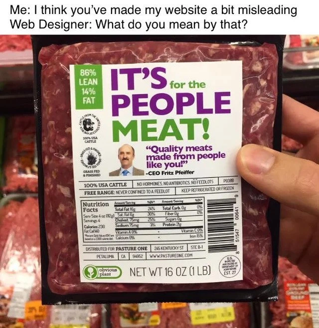
When ambiguous copy turns your friendly site into accidental cannibalism
Description
Meme format with a white text banner on top that reads, “Me: I think you’ve made my website a bit misleading Web Designer: What do you mean by that?”. Below, a hand holds a supermarket-style ground-beef package. The large green-and-purple label says: “86% LEAN 14% FAT IT’S for the PEOPLE MEAT!” Under that, a quote in purple reads, “Quality meats made from people like you!” - CEO Fritz Pfeiffer (face on photo is blurred). Small print includes: “100% USA CATTLE • NO HORMONES, NO ANTIBIOTICS, NO FEED LOTS”, “FREE RANGE: NEVER CONFINED TO A FEEDLOT”, a full Nutrition Facts panel, the “obvious plant” logo, and “NET WT 16 OZ (1 LB)”. Visually, the typography hierarchy makes “PEOPLE MEAT” the focal phrase, creating a darkly humorous implication that the product is made *of* people rather than *for* people. Technically, the meme satirizes poor UX copywriting, misleading information architecture, and the communication gap between stakeholders and web designers, highlighting how unclear wording or layout can completely change user perception


Comments
9Comment deleted
One misplaced font weight and your “Meet the People” page becomes a “People Meat” endpoint - legal’s opening a GDPR ticket while SRE pages Hannibal on-call
This is what happens when you deploy straight to production without a design review - suddenly your A/B test for customer engagement becomes an FBI investigation
This is the visual equivalent of a SQL injection attack on user expectations - technically valid markup, catastrophically wrong semantic interpretation. The designer clearly optimized for character count over parse tree clarity, resulting in a O(horrifying) user experience. It's a perfect reminder that in both code and design, ambiguity isn't just a bug - it's a feature that makes your product literally indigestible. Every senior engineer knows: whitespace isn't wasted space, it's the difference between 'helping your Uncle Jack off a horse' and... well, you get the idea. This is why we have design systems, code reviews, and the fundamental principle that context-free grammars should never be applied to human communication
Marketing shipped "It's for the people meat" and the parser chose the wrong parse tree - operator precedence matters outside the compiler too
Classic UX dark pattern: typography so poor it passes WCAG scans but fails the Hannibal Lecter litmus test
Proof that typography is a production dependency: a greedy H1 line break turned 'for the people' into 'people meat' - Legal just filed a Sev-1
😳 Comment deleted
Is that...real? Comment deleted
It's people for the meat Comment deleted