
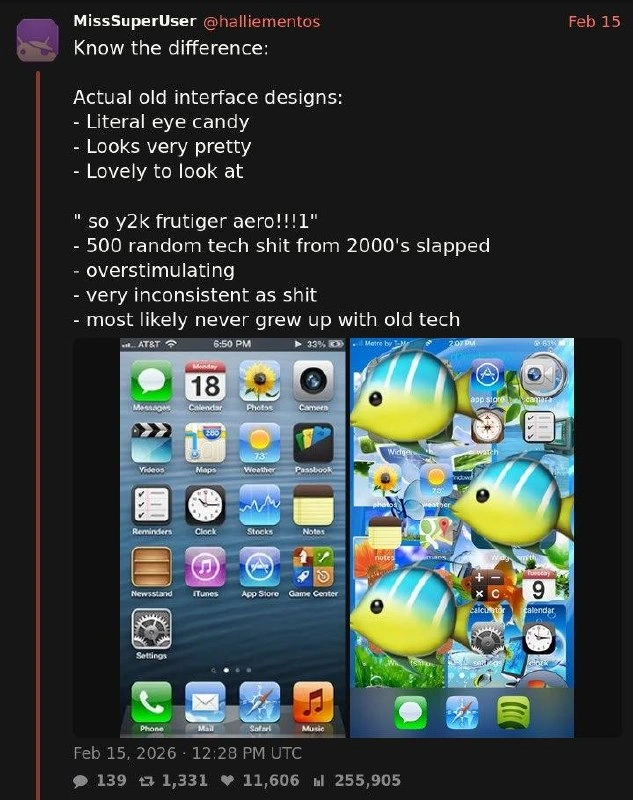
Know the Difference: Real Skeuomorphic iOS vs Fake 'Frutiger Aero' Nostalgia
Description
A screenshot of a post by MissSuperUser (@halliementos) dated Feb 15, 2026 (139 replies, 1,331 reposts, 11,606 likes, 255,905 views) reading: 'Know the difference: Actual old interface designs: - Literal eye candy - Looks very pretty - Lovely to look at' versus '"so y2k frutiger aero!!!1" - 500 random tech shit from 2000's slapped - overstimulating - very inconsistent as shit - most likely never grew up with old tech'. Below are two iPhone home screens: on the left, a genuine skeuomorphic iOS 6 layout with glossy icons (Messages, Calendar, Photos, Camera, Maps, Weather, Passbook, Newsstand, iTunes, App Store, Game Center, Settings) over a blue ripple wallpaper; on the right, a chaotic mock-aesthetic collage covered in giant tropical fish emoji over scattered icons. The post argues real 2000s-era UI design was coherent craftsmanship, while the modern 'frutiger aero' nostalgia trend is an overstimulating pastiche by people who never used the originals

Comments
13Comment deleted
Skeuomorphism took a decade of designers to perfect, flat design one keynote to kill, and now it's being revived by people whose primary source is a Pinterest board
Skeuomorphism gave you affordances; nostalgia-core gives every fish `z-index: 9999`.
personally I find that iPhone screenshot ugly as shit Comment deleted
signed, someone who grew up with windows xp and android 6. windows was pretty, mobile was very much not Comment deleted
oh and even that has a huge asterisk. windows was VERY pretty … for 5 minutes. as soon as you open any sufficiently advanced window it's back to windows 9x styling or worse. it's not that I find W9x ugly, but the mismatch between even just the native xp window frame and the inherited W9x contents is fucking terrible Comment deleted
I dont recall this being as huge problem as it was in the win10 era, when 10 got styling from: - late 10 - early 10 - win 8 - win 7 - and pre-7 era sometimes Its quite a new thing for every app to reinvent the controls from scratch, making everything inconsistent Comment deleted
yea it got a lot worse with time Comment deleted
and that was one of the reasons why i used "classic" theme on winxp, and not the default luna one it feeled better that way Comment deleted
I kind of used both in different times Comment deleted
it's beautiful though 😭 Comment deleted
KDE was the shit Comment deleted
s/the // Comment deleted
I wonder, how you all notice Comment deleted