
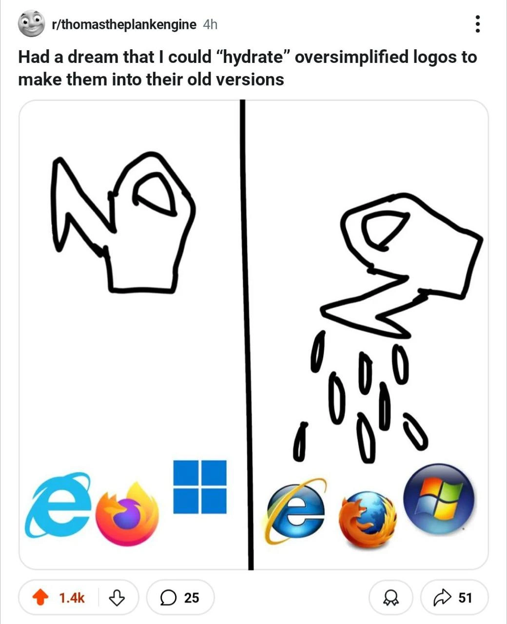
Hydrating flat logos back to their skeuomorphic glory
Description
A two-panel comic from a Reddit post titled 'Had a dream that I could “hydrate” oversimplified logos to make them into their old versions'. The left panel shows a crudely drawn watering can next to modern, flat, minimalist logos of Internet Explorer, Firefox, and Windows. The right panel depicts the watering can pouring water onto them, transforming them into their older, more detailed, skeuomorphic versions from the 2000s era - the glossy Internet Explorer 'e' with a golden ring, the detailed Firefox fox wrapping a globe, and the Windows Vista/7 aero glass logo. The humor comes from the term 'hydrate,' a technical term from frontend development (e.g., React) for making a static page interactive. Here, it's cleverly repurposed to mean restoring the 'life,' depth, and detail that have been stripped away in the modern trend of corporate logo oversimplification, a sentiment many senior developers who grew up with the older designs can relate to

Comments
24Comment deleted
Modern logos are like serverless functions: stripped of all state and character for maximum scalability. I miss the days when a UI had enough glossy, stateful buttons to crash a machine with the majesty it deserved
If React could hydrate brand guidelines this effectively, marketing’s asset repo would lose 30 GB and design would finally stop filing “make it flatter” tickets
Just like how we 'hydrate' dehydrated DTOs back into full domain objects, except this time we're restoring the bloated gradients and drop shadows that our CPUs spent half their cycles rendering back in 2007 - when a browser icon had more polygons than our entire WebGL budget today
Ah yes, the 'hydration' process - because nothing says 'progress' like spending millions on rebrands to remove the gradients and shadows that cost millions to add in the first place. It's the circle of life, except it's a flat circle now with 2px borders and we call it 'modern.' Meanwhile, senior devs remember when buttons looked like buttons and you didn't need a PhD in minimalism to find the clickable area. The real technical debt isn't in the codebase - it's in our collective muscle memory trying to find the 'Save' icon that's now just three ambiguous lines
If hydration can bring back the glossy IE/Firefox/Win7 logos, the next PR will re‑hydrate ActiveX and Aero - congrats, you’ve shipped Skeuomorphism‑as‑a‑Service with a mandatory Silverlight dependency
If only React’s hydrate() worked on branding - flip a feature flag, mount gradients and bevels, then listen to perf scream about the extra bytes
Hydration turning minimalist MVPs into gloriously bloated legacy systems - one gradient at a time
frtgr ar Comment deleted
Personally, I like the modern ones more. Logo doesn't have to be beautiful, it has to be recognizable at first sight Comment deleted
But the beautiful ones are recognizable at first sight too Comment deleted
skeuomorphism is ugly most of the time and I'm happy we're finally over it Comment deleted
The new firefox logo is absolutely beautiful, definitely more tasteful and professional looking. Idk why people obsess about the old ones so much, design practices evolve for a reason, people seem to prefer cleaner, more abstract and less skeuomorphic designs, what's wrong with that? Comment deleted
And this even better Comment deleted
what is going on with her spine? Comment deleted
She's flexible, probably😁 Comment deleted
people? or corporations? ;) Comment deleted
Corporations don't really have personal preference. There would be no reason for them to force a new design language upon the public. They just cater to what people prefer Comment deleted
Discord's new GUI makes me think those same corpos are wearing those goggles to simulate being drunk Comment deleted
discord's gui is bad not because of modern design language, it's just badly designed Comment deleted
https://i.kym-cdn.com/entries/icons/facebook/000/036/211/cover6.jpg Comment deleted
maybe just nostalgia as the grass was greener before etc. It actually is possible to weaponize it, rolling back to old design Comment deleted
So that's why Linux distros still looks like old days Comment deleted
Ai generated logos Comment deleted
the problem with modern logos is that they look so generic, it starts to seem like many of them are just different permutations of one logo Comment deleted