
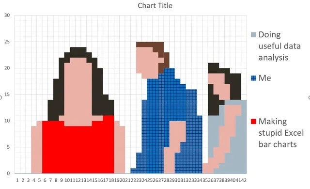
The Art of Procrasti-Plotting
Description
A clever meta-meme where a bar chart is used to create a pixel-art representation of the classic 'Distracted Boyfriend' meme. The chart, titled 'Chart Title', is composed of many small, colored bar segments on a grid. These segments form the image of a man in a blue shirt looking back at a woman in a red dress, while his girlfriend in a light blue top looks on disapprovingly. A legend on the right clarifies the joke: the girlfriend represents 'Doing useful data analysis', the distracted boyfriend is labeled 'Me', and the woman in red is 'Making stupid Excel bar charts'. The humor lies in the self-referential act of spending an inordinate amount of time on a frivolous, unproductive task (making a meme in Excel) as a way to procrastinate on the actual, important work of data analysis

Comments
7Comment deleted
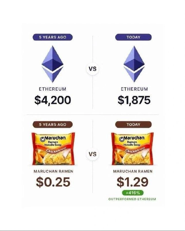
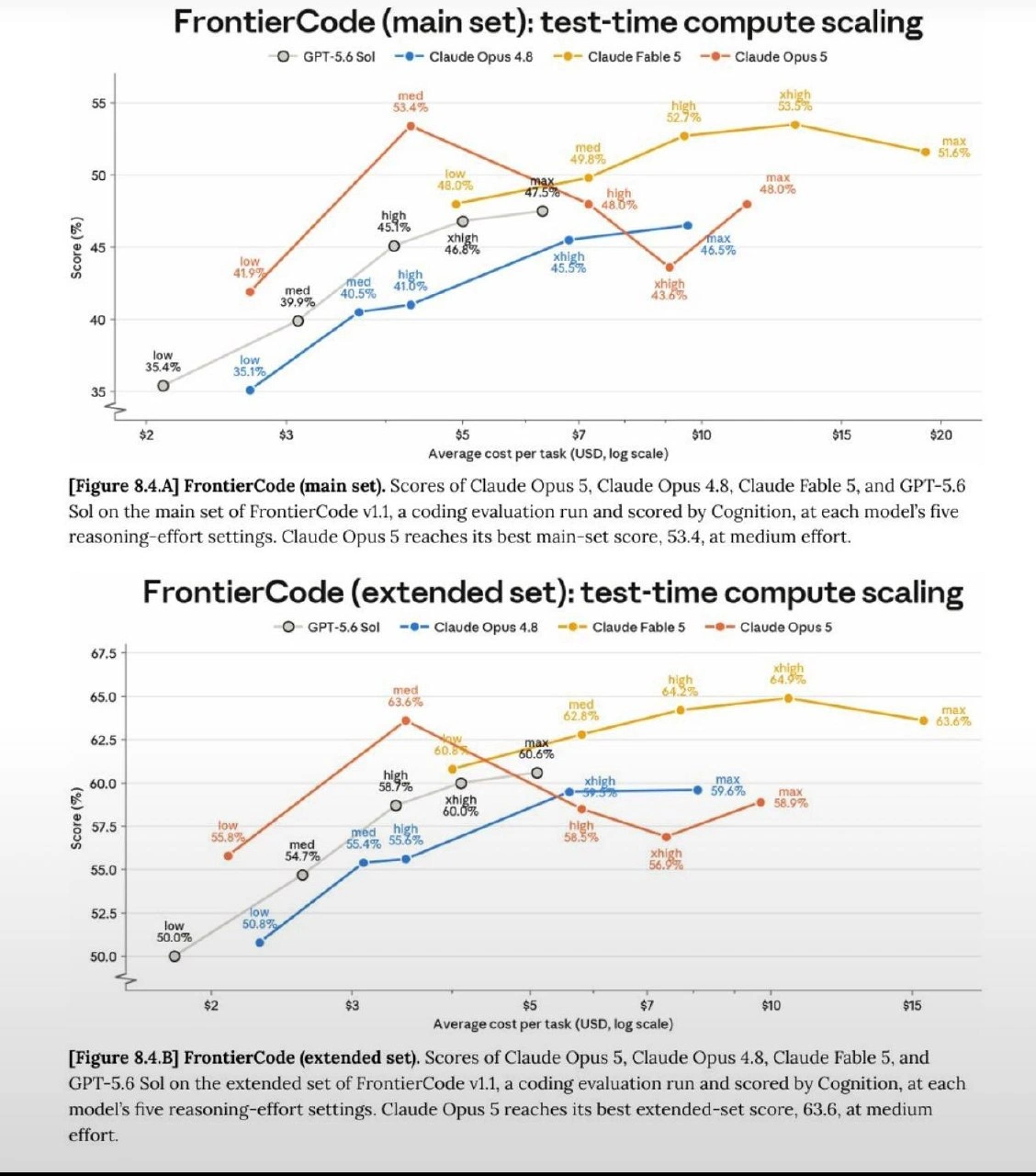
They say a picture is worth a thousand words. This chart is worth a thousand rows of unanalyzed data and one very amused, but very unemployed, data scientist
We replaced the Hadoop cluster with a real-time Kafka → Flink → Snowflake pipeline, and the VP still exports to Excel to hand-paint a bar-chart self-portrait - turns out our BI bottleneck is pixel density
The real irony is spending 3 hours perfecting the pixel art in a chart about wasting time on charts, then realizing you could've built an entire dashboard in Tableau in half that time - but where's the fun in that when you can abuse Excel's cell formatting to create art?
This chart perfectly captures the Pareto Principle in reverse: 80% of your time goes into making the chart look presentable, 20% into the actual analysis. The real kicker? You're using Excel's default chart engine instead of matplotlib or D3.js, which means you'll spend another hour fighting with axis labels and legend positioning. At least when the stakeholder asks 'can you make it pop more?' you'll have already invested enough sunk cost to justify starting over in PowerBI
Pareto principle for data viz: 80% time formatting sparklines, 20% querying the actual data
We built Kafka→Spark→Snowflake; the dashboard is an Excel bar chart of our faces - apparently self‑service BI means making 8‑bit selfies
Enterprise analytics: six hours perfecting conditional formatting, zero minutes reducing variance - yet the slide deck claims our time‑to‑insight improved