Skip to content
DevMeme
4420 of 7435
Monitoring engineers instantly spot terrifying metric spikes on the dashboard
Observability Monitoring Post #4840, on Sep 2, 2022 in TG

Monitoring engineers instantly spot terrifying metric spikes on the dashboard

Why is this Observability Monitoring meme funny?

Level 1: Scary Numbers

Imagine you’re riding in a car and suddenly the engine’s warning light on the dashboard starts flashing red and the temperature gauge shoots up. A seasoned driver (like a monitoring engineer for cars) will immediately tense up, point at the dashboard, and say “Uh oh, that’s bad!” You, as a passenger, might not have noticed the little dial moving, but the driver knows instantly that those numbers mean trouble – maybe the car’s overheating.

This meme is basically showing that scenario in a computer world. The “scary numbers” are like the red warning lights or big spikes on a chart that mean something is wrong in a system. The first picture has people looking at the screen confused, waiting for something obvious. The second picture is a guy on a couch suddenly pointing at the TV excitedly – he’s the experienced one who spots the problem right away. It’s funny because it’s true: the people who keep an eye on things all the time can quickly notice when a number goes crazy, just like a chef noticing a pot boiling over or a doctor noticing a patient’s heart rate jump. The meme makes us laugh by showing how fast the experts react – practically jumping out of their seat to point out the issue – while everyone else is still staring and trying to figure out what they’re even looking at. In simple terms: something weird shows up on the monitoring screen, and the experts go “Look! There it is!” before anyone else even realizes what’s happening.

Level 2: When Graphs Attack

Let’s break this down in simpler terms. In software teams, monitoring engineers are the people responsible for watching over the health of applications and services. They set up dashboards filled with charts and graphs that show all kinds of metrics – like how many users are on the site, how fast pages load (latency), how many errors are happening, or how much memory servers are using. These dashboards are usually displayed in real-time, updating constantly so you can literally watch the heartbeat of a system.

Now, a metric spike is when one of those lines on the graph suddenly jumps way up (or sometimes drops way down) in a short time. Imagine one graph line that’s usually low and steady suddenly shoots upward like a rollercoaster – that’s the “scary numbers” the meme is talking about. For example, if normally you see ~50 errors an hour, and suddenly it’s 5,000 errors in the last minute, that’s a huge spike. On a dashboard, it might look like a needle shooting into the red zone. Scary! :chart_with_upwards_trend:

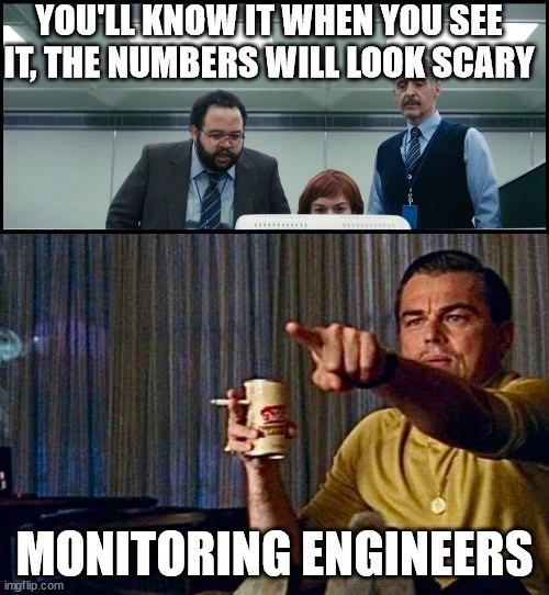
In the top image, the text says “You’ll know it when you see it, the numbers will look scary.” This implies someone (maybe a manager or a new analyst) is instructing the team to watch the metrics for something obviously wrong. The three office workers leaning in with tense looks represent people who aren’t experts in monitoring – they’re staring at the screen, unsure what to look for until it’s blatantly obvious. It’s like someone told them, “If something bad happens, the graphs will make it obvious.”

The bottom image then labels “Monitoring Engineers” and shows Leonardo DiCaprio pointing excitedly at a screen. This is a popular meme format used to say “Look! There it is!” In context, it means the monitoring engineers don’t hesitate – the moment anything off-normal appears on the dashboard, they pounce. They can spot the exact graph and the exact spike that indicates a serious issue, almost instantly. While the folks in the top panel look a bit confused about what qualifies as “scary” numbers, the experienced engineers in the bottom panel immediately recognize the danger.

This contrast is the joke. It’s common in tech teams that SREs or devops folks have a deep familiarity with their systems’ normal patterns. They know, for instance, that CPU usage at 80% might be fine during peak hours, but an error rate above 1% is absolutely not okay. So they don’t need to be told twice – their eyes are trained to find that one graph in a dozen that suddenly looks wrong. They might literally lean forward and point at the screen, saying “There! That’s the spike – something’s definitely broken.” Meanwhile, someone less familiar might only see a bunch of squiggly lines and not realize which one spells trouble.

The meme is targeting Observability and On-Call culture with humor. In real life, being on on-call duty means you’re responsible for reacting if the system has problems (like outages or slowdowns). Many teams use alerting tools that send a loud notification (an alert) when metrics cross certain thresholds. But even with alerts, someone often has to look at the dashboard to diagnose what’s happening. Dashboard anxiety is a real thing – during a tense situation, everyone might be watching the monitoring dashboard, waiting for clues. The top panel’s text “you’ll know it when you see it” jokingly captures that feeling of staring at graphs, hoping the problem will jump out at you. And the bottom panel — well, that’s the moment the problem does jump out, and the monitoring engineer is like “Gotcha!”

In summary, the meme emphasizes:

  • Monitoring systems produce a lot of data, but you need experience to interpret it quickly.
  • A “scary number” could be anything wildly outside normal range (huge spike in errors, traffic, latency, etc.).
  • Monitoring engineers have seen enough incidents that they react very quickly to anomalies – sometimes even before any automatic alert, just by recognizing an unusual pattern.
  • It’s poking fun at how obvious a critical problem looks after you spot it – as if it were easy, when in fact it takes skill and attentiveness to notice it immediately.

Even if you’re a junior developer or new to on-call, you can appreciate this: it’s like the difference between looking at a foreign language text and actually reading it. The experts can read the dashboard fluently, the newbies are still trying to identify individual letters. When something bad is happening in production, you want that Leo-pointing person on your team who can yell out “I see the issue!” without hesitation. It’s both reassuring and, as the meme highlights, a little humorous how fast they catch it.

Level 3: Telemetry Terrors

In the world of Observability and Monitoring, veteran SREs develop a near-supernatural ability to spot trouble in a sea of metrics. In the top panel of this meme, a trio of baffled office folks stare at a dashboard, clinging to the advice “you’ll know it when you see it, the numbers will look scary.” It’s an almost comically naive monitoring strategy – as if Key Performance Indicators (KPIs) on a graph will literally turn red and sprout fangs. But to an experienced on-call DevOps/SRE engineer, that’s not entirely a joke: we’ve seen enough metric spikes to indeed “know it when we see it.”

The bottom panel cleverly uses the famous Leonardo DiCaprio pointing meme (from Once Upon a Time in Hollywood) to represent Monitoring Engineers in action. Beer in one hand, finger on the screen – that’s the seasoned SRE instantly recognizing a telemetry anomaly. To others, the dashboard might look like a bunch of squiggly lines, but we spot the one line that just shot off the charts. Maybe the error rate jumped from 0.1% to 5% in a minute, or CPU usage flatlined at 100%. The moment that happens, every battle-hardened on-call engineer’s heart skips a beat as they mutter, “there’s our problem.” It’s practically a reflex born from countless late-night pages and production incidents.

This meme humorously captures that observability sixth sense. The non-experts in the first panel are waiting for an obvious horror-movie jump scare on the graph (“scary numbers”) – and frankly, by the time a metric looks terrifying, the outage is probably already in full swing. Any seasoned DevOps person will tell you that you ideally set up alert thresholds and monitoring systems (Prometheus, Datadog, CloudWatch, etc.) to catch issues early. But even with automated alerts, human intuition plays a role: you often notice an odd blip or dashboard irregularity before the alarms go off. This is where shared SRE war stories come in. We’ve all been huddled around Grafana boards or Splunk logs, eyes bloodshot at 3 AM, when someone suddenly channels their inner Leo DiCaprio – jabbing a finger at a graph yelling “THERE! That spike in 500 errors – that’s new!” It’s both terrifying and impressive how fast monitoring engineers react.

The humor also nods to alert fatigue and on-call trauma. After being flooded with thousands of trivial alerts, you’d think an engineer would go numb. And yet, show them one truly scary number – like latency skyrocketing from 50ms to 5000ms – and you’ll see that Pavlovian response: an immediate point-at-screen moment. It’s a mix of adrenaline and “aha, found you!” excitement. Essentially, the meme distills a common reality in DevOps humor: the difference between someone merely looking at metrics and someone seeing the problem. The seasoned monitoring engineer doesn’t just glance – they read the dashboard like a thriller novel, instantly recognizing the villain in the plot (be it a memory leak, surge in traffic, or yes, it’s always DNS some network meltdown). That instant recognition – equal parts skill, experience, and caffeine – is what makes this image so funny and relatable to on-call veterans. It pokes fun at how obvious things appear in hindsight, and how quickly the pros can zero in on the “scary” graph that signals an incident.

Description

Two-panel meme. Top panel: three suited office workers crowd around a desktop monitor; their expressions are tense. Bold white meme text over the image reads: "YOU'LL KNOW IT WHEN YOU SEE IT, THE NUMBERS WILL LOOK SCARY." Bottom panel: the well-known Leonardo DiCaprio "pointing" scene - he sits on a couch, beer can and cigarette in hand, arm outstretched, finger aimed at the screen. Caption in the same bold font across this frame reads: "MONITORING ENGINEERS." Visually, the meme contrasts puzzled non-experts with the instant recognition of telemetry anomalies by observability/SRE staff, humorously capturing the real-world experience of spotting scary KPI spikes on production dashboards and rushing to triage

Comments

7
Anonymous ★ Top Pick Senior SRE skill: noticing the 0.03 % 5xx blip and mentally subtracting it from the quarter’s error budget before PagerDuty even clears its throat
  1. Anonymous ★ Top Pick

    Senior SRE skill: noticing the 0.03 % 5xx blip and mentally subtracting it from the quarter’s error budget before PagerDuty even clears its throat

  2. Anonymous

    After 15 years in the trenches, you develop a sixth sense for production issues - that subtle CPU spike at 3am isn't just 'normal variance,' it's the ghost of a memory leak that's been haunting your microservices since the last 'quick fix' deployment three sprints ago

  3. Anonymous

    Every SRE has that sixth sense - you don't need to wait for the PagerDuty alert when you can already see the hockey stick graph forming. It's like pattern recognition trained on years of 3 AM incidents: normal, normal, normal, OH NO. The real skill isn't reading the metrics; it's knowing which scary numbers mean 'restart the pod' versus 'update your résumé.'

  4. Anonymous

    Runbook says 'You'll know it when you see it' - translation: thresholds tuned by vibes; the SRE points at p99 latency breaching the SLO before PagerDuty dials, because intuition outruns our misconfigured PromQL

  5. Anonymous

    No ML anomaly detection needed; when p99 latency hits 10s and error budget evaporates, even interns spot the carnage

  6. Anonymous

    Enterprise anomaly detection: if looks_scary(graph) then page_oncall; precision 0, recall 1 - perfect for turning your error budget into a burn-rate chart

  7. @chupasaurus 3y

    Anomaly detection ftw

Use J and K for navigation