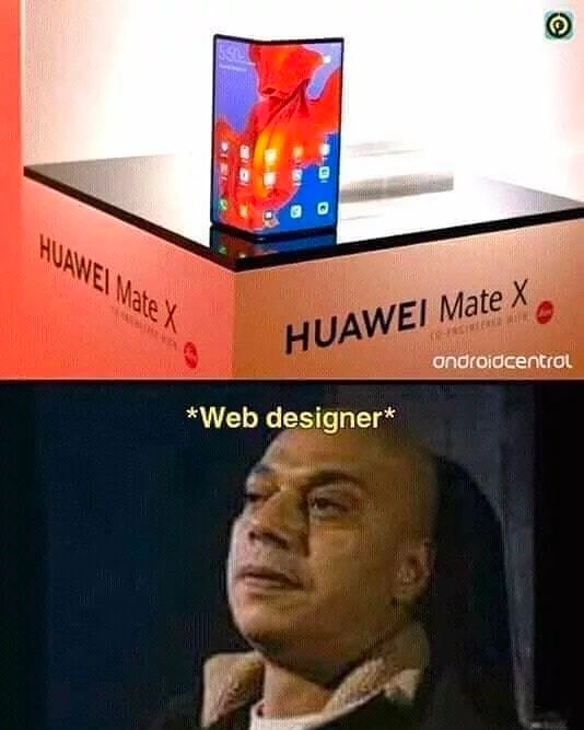
Foldable Huawei Mate X hype meets developers’ jaded reaction in meme form
Why is this Hardware meme funny?
Level 1: The Shape-Shifting Picture Frame
Imagine you spent weeks painting a picture that fits perfectly in a tall, narrow frame. Then someone invents a magic frame that can suddenly snap open into a wide square one — and tells you your painting must look perfect in both shapes, and even while the frame is changing. The top photo is the company proudly showing off the cool transforming frame; the bottom photo is the painter trying not to cry. That's the whole joke: one person's shiny new toy is another person's homework forever.
Level 2: What Responsive Design Asks of You
Responsive design is the practice of making one website adapt to any screen size, mainly through media queries — CSS rules that apply only under certain conditions:
/* Phone layout by default */
.gallery { grid-template-columns: 1fr; }
/* Tablet-ish widths get more columns */
@media (min-width: 768px) {
.gallery { grid-template-columns: repeat(3, 1fr); }
}
The catch is choosing breakpoints — the widths where layout changes — and a foldable phone is a device that walks across your breakpoints while the user is looking at the page. The viewport (the visible area your page renders into) suddenly resizes from narrow phone to wide tablet, images reflow, text wraps differently, and anything you positioned with fixed pixel assumptions breaks. Early-career frontend devs usually meet this genre of pain the first time a layout that looked perfect in Chrome DevTools shatters on a real device — foldables just industrialized that experience. The crying man is every designer realizing their carefully tuned mockups now need a third (and fourth) canvas, plus a rule for the seam down the middle.
Level 3: The Viewport Matrix Just Grew a Hinge
The top panel shows the Huawei Mate X on its glossy launch pedestal — unfolded into a tablet, branding everywhere, the full trade-show triumph shot. The bottom panel is a man visibly fighting back tears, captioned "Web designer". The juxtaposition needs no further text, because everyone in frontend knew immediately what that hinge meant: the responsive design problem, which the industry had spent a decade declaring solved, just got a new dimension. Literally.
The pre-foldable contract was already fragile but at least static: a device had a viewport. You designed mobile-first, set breakpoints around 768px and 1024px, tested portrait and landscape, and called it done. Foldables broke the assumption underneath all of that — that screen geometry is fixed for the lifetime of a session. The Mate X transforms from a ~6.6" phone into an 8" tablet mid-interaction. That means:
- Runtime aspect-ratio changes that aren't orientation events, so a decade of
orientationchangehacks doesn't fire correctly - Screen continuity requirements: app state, scroll position, and layout must survive a transition between two entirely different form factors without jank
- A physical crease running through the canvas — a region where you shouldn't place buttons, faces, or text, which no CSS primitive could express at the time (the
env()viewport-segments anddevice-postureproposals came later, precisely because of devices like this one) - A testing matrix that just multiplied: every page now needs validation folded, unfolded, and during the fold, across vendors whose hinges all behave differently
The bitter joke embedded in the channel's own post — "we not only ones who is affected. Send this pic to you design bro" — is that this pain rolls downhill from hardware to developer to designer. Hardware vendors ship the innovation and the keynote; designers inherit the edge cases. And there's a beautiful irony the meme is silently sitting on: the design industry spent years arguing that "the fold" (the scroll line inherited from newspaper layouts) doesn't exist on the web. Then Huawei shipped one. Made of plastic. For $2,600.
It's the same pattern the industry repeats every cycle: the notch begat safe-area-inset, high-DPI screens begat srcset and a thousand image pipelines, and foldables begat posture APIs — each "exciting new form factor" is a press photo for the vendor and a permanent line item in everyone else's QA budget.
Description
The two-panel meme tops with a showcase pedestal lit in white and orange, displaying Huawei’s foldable phone; the text “HUAWEI Mate X” appears twice on the pedestal sides, and an “androidcentral” watermark sits bottom-right. The phone’s flexible OLED is half-bent, showing bright red and blue app icons, visually shouting cutting-edge mobile hardware. The bottom panel is a dimly lit reaction image of a bundled-up person leaning back, eyes half-closed, expression blank; only the leading text fragment “*W” is visible, hinting at a tired or unimpressed response. Technically, the meme contrasts industry buzz around foldable devices and 5G with the seasoned engineer’s well-worn skepticism toward every new hardware launch, poking fun at hype fatigue in the developer community

Comments
7Comment deleted
Foldables look cool - until you realize every hinge angle is a new breakpoint and your responsive layout just became an NP-hard origami problem
Finally, a device where our CSS grid can literally fold in on itself and we can blame it on the hardware
We finally got designers to accept that the fold doesn't exist - so hardware vendors shipped one, with a hinge
When product managers ask why the foldable phone layout isn't ready yet, just show them your 47 new media query breakpoints and explain that CSS Grid wasn't designed for Schrödinger's viewport - simultaneously tablet and phone until observed at the fold
Marketing proved the foldable “handles edge cases” by putting it on a podium corner; wake me when it survives 100k bends, pocket lint, and an OTA that doesn’t regress the touch driver
Flexbox meets its match: a screen that flexes back and breaks every layout assumption
Huawei Mate X on a 90° pedestal: great, Android now supports portrait, landscape, and corner-case