Microsoft Office Brand Evolution From Iconic to AI-Bloated M365
Why is this Microsoft meme funny?
Level 1: The Never-Ending Makeover
Imagine you have a favorite toy or tool that you use all the time. Let’s say it’s a really awesome paint set that everyone in school knows about. Now, picture this:
First, the paint set is super popular – almost every art project uses it, and it has a familiar, famous look. That’s like Microsoft Office being everyone’s go-to tool for documents and projects. It’s the big kid on the block, and everyone recognizes it.
Now, pretend a new kind of art comes along – like drawing together with friends online – but the company behind your paint set is slow to add that. Another company (let’s call them Googly Art) makes a cool online drawing board where the whole class can sketch together at the same time. Your paint set company didn’t have that feature at first, so a lot of kids started using Googly Art on cheap little art tablets (like those Chromebooks in schools) because it was easy and let everyone draw together. This is like Microsoft missing out when everyone started wanting to work together over the internet, and Google’s tools becoming the new cool thing for students. Microsoft’s tool was still around, but it felt old for group work, and a bunch of young people got used to the other tool.
Next, the paint set company says, “Hey, we have a new name now! We’re not just ‘SuperPaint’, we’re ‘MegaPaint 365’!” They put a new logo on the box. But when you open it up, it’s basically the same paints inside. You might scratch your head and go, “Uh, okay… was something different?” Not really – it’s mostly a makeover. This is like Microsoft renaming Office to Microsoft 365 – a new name and look, but Word and Excel inside were pretty much the same. It mostly just confused people about what to call it. It’s as if your favorite cartoon changed its title but kept the same story – you’d wonder why they bothered.
Finally, imagine that a year later, the paint set company changes the name again or adds a fancy subtitle, and this time they stuff in a new robot helper in the paint box. Like every time you try to mix colors, a little robot pops up and says, “I can mix that for you with AI!” Maybe it sounds cool at first – a robot assistant! – but then you realize it’s popping up all the time, even when you just want to do it yourself. It starts to get in the way, moving your brush or suggesting weird color combos when you didn’t ask. You’d probably get annoyed and shout, “Go away, I just want to paint like I used to!” That’s what the meme is saying Microsoft did by adding Copilot (an AI helper) into Office. It’s like Clippy, that old cartoon paperclip assistant, but superpowered with AI – and for some people, it’s just as unwelcome if it interrupts them.
So, in simple terms, this meme is joking that Microsoft keeps changing the name and look of their Office product and adding flashy new “improvements” that nobody really asked for, instead of just making the tool steady and easy to use. It’s like a friend who keeps reinventing themselves – new outfits, new catchphrases – but they’re actually not improving their behavior. The joke is that Microsoft thinks these changes are genius (hence the “expanding brain” images, suggesting big brain ideas), but many users find it all a bit silly and bothersome. It’s funny in the way it’s funny when a company tries way too hard to seem cool and ends up complicating things: we laugh because we recognize the pattern of overdoing it, like putting so many decorations on a cake that you can’t taste the cake anymore.
Level 2: Office Rebrand 101
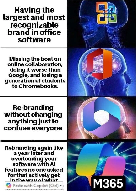
Let’s decode the meme in simpler terms. This four-panel image is using an expanding brain meme format – that’s a popular meme where a brain illustration glows more in each successive panel, usually to humorously imply that each step is a “higher level” idea (often the opposite is true, as a joke). Here, each panel pairs a Microsoft Office logo from a different era with a caption. The captions are highlighting how Microsoft’s strategy with Office changed (or failed to change) over time. We’ll go through each panel and explain the references and why they’re funny (or frustrating) to developers and tech-savvy folks:
Panel 1 – Old Microsoft Office logo (circa 2003): The caption says “Having the largest and most recognizable brand in office software.” This refers to the fact that for a long time, Microsoft Office was king of productivity software. Microsoft Office includes Word (for documents), Excel (spreadsheets), PowerPoint (presentations), etc. Back in the late 90s and early 2000s, almost everyone used Office for school, work, you name it. Its logo at the time was a set of four puzzle pieces in different colors – very iconic. “Most recognizable brand” is true: if you showed that logo to people, they’d say “That’s Microsoft Office”. So, Panel 1 basically says: Microsoft was on top of the world with Office. (The humor here is subtle – this is the starting point, nothing funny yet except it sets the stage: big famous product.)
Panel 2 – Office 365 logo (around mid-2010s): This panel’s caption is longer: “Missing the boat on online collaboration, doing it worse than Google, and losing a generation of students to Chromebooks.” Now it gets juicy. “Office 365” was Microsoft’s move to cloud and subscription. Its logo was a reddish-orange flat icon (kind of like a ribbon or a folded sheet – a modern take on the Office icon). The caption calls out that Microsoft missed the boat on online collaboration. This means when the world started wanting to edit documents online in real-time (multiple people at once, from a web browser), Microsoft was late or not as good. Google did this first in a big way with Google Docs. In Google Docs, you can send a link and your friends or classmates can all type in the same document together simultaneously – super handy for group projects, remote teams, etc. Microsoft Office was traditionally installed on your PC and only one person would edit a file at a time (others had to wait or you’d email attachments back and forth). Microsoft eventually created Office Online and collaboration features, but they were slower and initially clunkier compared to Google’s. The meme phrase “doing it worse than Google” hints that even when Microsoft added online collaboration, it wasn’t as smooth or user-friendly as Google’s solution.
The latter part, “losing a generation of students to Chromebooks,” refers to how Google capitalized on this in schools. Chromebooks are simple, affordable laptops running Google’s Chrome OS that primarily use web apps (like Google Docs). Schools, especially in the US, bought tons of Chromebooks because they are cheap to maintain and great for students to do homework on Google’s cloud. As a result, many students grew up using Google Docs/Sheets instead of Microsoft Word/Excel. This means an entire generation got used to Google’s tools (which are free for personal use) and didn’t necessarily buy Microsoft Office at home. For Microsoft, that’s a big deal: their once-loyal user base in education basically switched to Google. So the meme is pointing out a major strategic mistake by Microsoft – they were the big dog in 2003, but by not embracing the web quickly enough, they lost younger users who might never develop loyalty to Office. It’s phrased in a humorous way (“missing the boat” is a casual way to say “failing to take an opportunity”), but it’s a real criticism. For a tech newcomer: imagine the biggest toy company forgot to make an online game version of their top board game, and another company did it first, so all the kids moved to that other company’s game. Yeah, big oops.
Panel 3 – Microsoft 365 new logo (late 2010s): The caption: “Re-branding without changing anything just to confuse everyone.” Here, the logo shown is a bluish-purple loop Office 2019/Microsoft 365 icon. In 2019, Microsoft announced that the Office suite was being renamed to “Microsoft 365”. Essentially, they started calling the bundle of Word/Excel/PowerPoint by a new name, to emphasize that it’s more than just those apps (it includes cloud services, maybe Teams, etc.). The logo changed to a somewhat abstract shape with colors from across the Office family (blue, orange, purple, teal). The key point: this was mostly a marketing change. The apps themselves (Word, Excel, etc.) didn’t drastically change overnight with that rebranding. It was still the familiar Office apps, just under a new umbrella name.
The meme says “re-branding without changing anything” – meaning Microsoft just slapped a new name and logo, but the software is fundamentally the same old thing. “Just to confuse everyone” is the snarky part: indeed, a lot of people were confused! Some wondered, “Is Microsoft 365 a new product? Do I still use Office? What’s it called now?” Even IT professionals and developers joked about how Microsoft loves renaming things. If you weren’t following tech news, you might not realize that Microsoft 365 is basically Office with a new name. This is a common occurrence in tech (and especially at Microsoft historically): they rename or rebrand services frequently. For example, what’s now called Azure DevOps went through names like Visual Studio Online, Visual Studio Team Services, etc. It can feel arbitrary. So, this panel humorously captures that phase: Microsoft’s “brilliant idea” (sarcasm) was to rebrand Office in hopes of rejuvenating its image, but in practice it just bewildered users and didn’t offer real improvements at that moment. A developer or power user reading that caption will likely chuckle and shake their head, because we remember having to tell less techy colleagues “Yes, Microsoft 365 is just the new name for Office 365… No, it doesn’t have 365 apps, it’s just branding… Yes, I know it’s confusing.”
Panel 4 – Latest Microsoft 365 (M365) logo with Copilot tooltip: The caption here is the longest (and actually gets cut off in the image): “Rebranding again like a year later and overloading your software with AI features no one asked for that actively get in the way of what…” Basically, it implies: Microsoft rebranded yet again very soon after the last rebrand, and this time stuffed a bunch of AI features into Office (Microsoft 365), which nobody really requested, and those features are actually interfering with normal usage. The logo shown is the new multicolor “M365” logo – it’s very vibrant, with multiple colors merging into an
Mshape. Microsoft did start using an “M365” moniker in recent branding (for example, some icons or websites show “M365” to mean Microsoft 365). It might not be a wholly separate rebrand, but the meme portrays it as “again a rename about a year later” – probably exaggerating to make a point that Microsoft keeps changing names/branding frequently.More importantly, this panel calls out feature overload with AI. Microsoft introduced something called Microsoft 365 Copilot around 2023. Copilot is an AI assistant powered by advanced machine learning (OpenAI’s GPT-4, under the hood). In Office apps, Copilot can do things like generate a draft from a prompt, summarize documents, suggest formulas in Excel, design slides in PowerPoint, etc. Sounds cool, right? Except the meme is highlighting a common reaction: “We didn’t ask for this! And now it’s everywhere.” The phrase “overloading your software with AI features no one asked for” suggests that Microsoft piled on AI functions into Office not because users were begging, but because the company wanted to capitalize on the AI hype. In tech, we often see this with buzzwords – suddenly every product has to have “AI” in it, whether it improves the product or not.
The little overlay in the meme image showing “Paste with Copilot (Ctrl)” is especially telling (and funny to those who’ve experienced it). It implies that even a standard action like pasting text (Ctrl+V) might trigger an AI-driven feature (“Paste with Copilot” sounds like it would do something smarter than a normal paste, maybe formatting or rewriting text using AI). For a user who just wants their plain paste, that’s annoying. It’s like you go to open a door and a robot jumps in front of you to say, “Hi! I can open this door for you in a fancy way!” You’d be like, “Uh, please just let me do it.” So “actively get in the way” means these AI features pop up or interfere without the user initiating them. That can disrupt workflows and irritate people – especially those who didn’t want an assistant. A real-world parallel: think of those clippy cartoons in the 90s – if you typed “Dear Sir,” a paperclip character would bounce up saying “It looks like you’re writing a letter, need help?” Many found that intrusive and turned it off. Fast forward, and now Copilot might be offering to rewrite your sentence or when you paste some text, offering alternate phrasing via AI. Potentially useful sometimes, but certainly not something everyone asked for on every paste operation!
So this final panel is basically saying: Microsoft’s latest “great idea” (again, sarcasm) was to rename things yet again and flood Office with AI/ML features, to the point of overkill. The meme implies this happened very quickly after the last rebrand – “like a year later” – emphasizing how rapid and chaotic these changes feel. Power users and developers often prefer stability and control, so to them this is the opposite of what they wanted. It’s a bit like if a car manufacturer reissued the same car model next year with a different name and added a voice assistant that talks constantly while you drive – you’d be like, “Please, I just want to drive my car, stop rebranding it and distracting me!” That frustration is the heart of this panel.
Stepping back, what does this all mean in a broader sense? It’s highlighting a couple of tech-world concepts:
Branding in Tech: Companies often change product names, logos, or branding to refresh their image or reflect new strategy. Sometimes it’s warranted (big changes in the product), but sometimes it’s seen as just marketing fluff. Microsoft renaming Office to Microsoft 365 is seen by many as the latter case – mostly marketing-driven. The meme jokes about how these rebrands can be more confusing than helpful, especially if done frequently.
Feature Creep / Software Bloat: This is when a product keeps accumulating new features over time, possibly beyond what’s needed. New features aren’t inherently bad – innovation is good – but uncontrolled feature creep can make software complicated, slow, or hard to use. In this case, adding AI everywhere (“Paste with Copilot” and who knows what else) could be seen as bloat if it’s not elegantly integrated. Users might experience simple tasks becoming complex because there are too many options or prompts now. The meme specifically says “features no one asked for,” which is a key point: if the core user base didn’t request or need those features, and they’re mainly added because of a hype (in this case AI), that’s textbook feature creep. It often comes from corporate pressure (“we have to have AI in our product because everyone else does”), not from user-centric design. Copilot might be very powerful, but the joke here is that it’s perceived as unnecessary and even obstructive for many tasks.
Online Collaboration Miss: This refers to how crucial being able to collaborate online was (and is). Microsoft eventually introduced things like OneDrive and web versions of Word where multiple people can edit simultaneously. But Google was ahead by years. Losing younger users (“a generation of students”) is a huge cultural shift. Those students might enter workplaces advocating for Google Workspace instead of Microsoft out of familiarity. So that panel is about a competitive/market miss. In tech history, we’ve seen similar battles (like how Microsoft also initially missed mobile OS trends vs Android/iOS, though that’s another story).
Corporate Culture and Marketing vs. Reality: The meme overall is a bit of a jab at Microsoft’s corporate decisions. The people making these big rebranding or feature decisions might be marketing teams or top executives trying to catch up with competitors or polish the company’s image. The reality for developers and day-to-day users is different: they care if the product is reliable, fast, and does what they need. So there’s a gap between what marketing thinks is a brilliant move (new name! AI everywhere!) and what users experience (confusion and interruptions). This is common in large companies – sometimes decisions are made for strategic or image reasons more than purely to delight users. The meme exposes that by showing each step as supposedly “brainier” while actually alienating users more.
Developer Experience (DX): While Office is not a developer tool, many developers use it for documentation or communication. Plus, the scenario is very relatable to things we see in developer tools too. (For instance, imagine your favorite programming framework changing its name frequently and adding complex “magic” features you never asked for – you’d be annoyed.) The tag DeveloperExperience_DX is about how a developer feels using a product. Here, the DX of Microsoft Office for a tech-savvy person is deteriorating with these changes – first confusion from renames, then frustration from intrusive features. For example, a developer who was quick at writing design specs in Word using keyboard shortcuts now has to wrestle with an AI prompt or find where the menu moved. That hurts their experience. The meme doesn’t explicitly mention coding, but the feeling is universal for software: constant, needless changes can degrade user experience, whether you're coding or editing a document.
To connect it to an everyday concept: think of Microsoft Office like a really popular tool or even a game that everyone used, and over the years the company behind it keeps making odd changes. First they ignore an important new trend (so it falls behind competitors), then they change its name/logo (so people get confused if it’s even the same thing), and then they cram in a trendy new technology (AI) that kind of annoys the users. Each step, the company probably thought “This will make it better!” but loyal users felt, “This actually makes it worse (or at least not better) for me.” That dissonance is what the meme humorously points out.
A quick note on that tooltip “Paste with Copilot (Ctrl)” in the image: This looks like a screenshot from the actual software or a mock-up mimicking it. “Ctrl” likely stands for the Ctrl key, hinting at a keyboard shortcut. If true, it might mean Microsoft considered or implemented a feature where pressing Ctrl (maybe twice, or some combo) triggers a Copilot paste action. Even if it’s just for humor, it’s not far-fetched; Microsoft did integrate Copilot into many actions. For a power user, seeing that might induce a groan: “Great, now my familiar shortcut is doing something fancy instead of the plain old paste.” It encapsulates the sentiment of unwanted change.
In summary, this meme is a critique of Microsoft’s handling of the Office product line over time:
- Initially unbeatable and widely recognized (huge brand power).
- Then a big oversight – letting Google leap ahead in a new paradigm (cloud collaboration) and losing younger users by not adapting quickly.
- Next, trying to recover or refresh via renaming (branding) rather than deep improvements, causing confusion.
- Finally, chasing the latest craze (AI) and overdoing it, possibly to the detriment of user experience, and doing yet another name tweak around the same time.
Each stage is exaggerated as a “big brain enlightenment” moment, which is tongue-in-cheek. The meme resonates with developers and IT folks because we’ve lived through those transitions and often joked about them:
- We remember the Office 2003 era fondly (it just worked, everyone knew it).
- We sighed during the early Office 365 era when Google Docs was simpler for quick collaboration.
- We poked fun at the Microsoft 365 rebrand on forums (“RIP Office, long live Office, now called Microsoft 365 – whatever, I’m still calling it Office!”).
- And currently, we’re both excited and wary of the AI invasion in every app (some see potential, others see Clippy rebooted).
For someone newer to these concepts, think of it as a company making a lot of changes that seem flashy but aren’t necessarily making customers happier. That’s why it’s funny – it’s pointing out the disconnect between what Microsoft might think is innovative versus what users actually experience. The humor has a bit of a “tech insider” vibe; if you know the context (Office vs Google, Clippy vs Copilot, etc.), you chuckle and perhaps roll your eyes. Even if you didn’t know all that, now you can see the meme is basically saying: “Microsoft keeps changing the name and adding stuff to Office – sometimes missing big trends, sometimes just for show – and it’s kind of a mess!” Classic tech satire.
Level 3: Galaxy Brain Branding
At first glance, this meme flashes through Microsoft Office’s turbulent evolution using the classic expanding brain format. Each panel cranks up the brain’s luminescence as if each decision is a higher form of enlightenment – but the punchline is that the “enlightenment” comes from increasingly absurd corporate moves. Seasoned developers recognize this pattern of marketing-driven churn and feature creep. The meme’s humor lies in how each stage, supposedly a galaxy brain idea from Microsoft’s leadership, is really just putting more lipstick on the same pig (and then teaching the pig AI tricks no one wanted). Let’s break down the ascent into this corporate nirvana of nonsense:
Panel 1 – Old Office logo (2003): “Having the largest and most recognizable brand in office software.” This was Microsoft Office in its prime: the multi-color puzzle-piece logo was ubiquitous. Word, Excel, PowerPoint – these were household names. Office had a near-monopoly; its file formats (
.doc,.xls) became industry standards. Starting here makes sense – it was Microsoft’s golden goose, a brand powerhouse. The brain is dimmer in this panel because, ironically, just resting on your laurels (even giant ones) is the baseline. Senior engineers nod: Sure, having the dominant product is great, but what’s next?Panel 2 – Office 365 orange logo: “Missing the boat on online collaboration, doing it worse than Google, and losing a generation of students to Chromebooks.” Now the brain glows brighter, yet the caption describes a huge misstep. Here the meme shifts into irony: Microsoft’s “more evolved” brain managed to completely bungle the move to cloud-based collaboration. By the late 2000s and early 2010s, Google Docs and Google Workspace (formerly G Suite) introduced realtime co-editing of documents in a browser. Meanwhile, Microsoft was dragging its feet with clunky SharePoint and web versions of Office that felt like second-class citizens. They had the on-premise titan but responded slowly to the online collaboration revolution. The result? Schools handed out inexpensive Chromebooks (running Google’s Chrome OS) to students, who grew up writing essays in Google Docs instead of Word. An entire generation became fluent in Google’s ecosystem. Watching Microsoft fumble here felt almost tragic to industry vets: the brain got “bigger,” but the idea was actually worse. Corporate inertia and complacency meant Office 365’s early online features were half-baked, and Google ate their lunch in education. The meme highlights this as a kind of twisted enlightenment: “Aha, let’s ignore the cloud until it’s too late!” – the opposite of wisdom, yet presented in the meme as a glowing-brain moment. This is classic MarketingVsReality – Microsoft marketed Office 365 as the future, but reality was Google had already defined online collaboration’s gold standard.
Panel 3 – Newer Office (Microsoft 365) logo: “Re-branding without changing anything just to confuse everyone.” Here the brain image is nearly cosmic, and that sarcasm is strong. Microsoft, having realized they were behind, didn’t drastically improve the product at this stage – instead, they rebranded. Office 365 became “Microsoft 365” around 2019-2020, complete with a shiny new blue/purple looping logo. Did Word or Excel suddenly transform overnight? Nope. This was largely a surface-level change. The same old Office suite got a new name, presumably to signal “it’s not just Office anymore, it’s a lifestyle!” or maybe to distance from the stagnation. To users and IT departments, it felt like a bait-and-switch: “Wait, is Office gone? What is Microsoft 365? Do we need to buy something new?” Documentation and training materials went out of date with a marketing press release. Nothing fundamental was fixed – the clunky aspects of Office 365 remained, the online apps were still catching up, but now everyone had to use a new name. Veteran developers recognize this as the classic corporate move: instead of solving root problems (like why Google Docs was beloved), just rebrand and declare victory. Internally, some product manager probably got a bonus for “revitalizing the brand,” while engineers rolled their eyes. The meme’s third stage implies that someone at Microsoft considered this confusion-inducing rebrand a brainwave of genius equivalent to an enlightened mind. Senior devs know better – it’s the same old codebase, technical debt and all, wearing new clothes. (At this point, the expanding brain format is in full satire mode – the bigger the brain, the dumber the strategy.)
Panel 4 – Latest M365 logo + “Paste with Copilot (Ctrl)” tooltip: “Rebranding again like a year later and overloading your software with AI features no one asked for that actively get in the way of what…” This final tier is supernova-bright with enlightenment… achieved by even more dubious decisions. Microsoft apparently wasn’t content with one rebrand; they went for another tweak (slapping an “M365” label on that multicolored swirl) within a short time. And as the cherry on top, they jammed AI features everywhere, notably the new Copilot AI assistant. The image’s little tooltip “Paste with Copilot (Ctrl)” says it all: even the simple act of pasting text might now invoke some AI-driven behavior. Feature creep overload – to a point of hindering basic functionality – is the ultimate “galaxy brain” move being mocked here. The meme text cuts off (“…get in the way of what…” likely would end with “…of what you’re actually doing”), implying the sentence (and by extension, the user’s work) is interrupted – much like how an unwanted AI popup might cut into your workflow. This is painfully on the nose for anyone who’s battled unwanted AI assistants or intrusive features (cue flashbacks of Clippy: “It looks like you’re writing a letter, need help?”). Microsoft’s new Copilot is far more advanced than Clippy – it uses actual AI/ML to generate text, formulas, even code – but the meme suggests it’s just as annoying when forced on users. The humor here is darkly rich: the peak of enlightenment in Microsoft’s journey is portrayed as essentially ruining the user experience with hyper hype-driven features. It’s like the company went “We must not miss the next boat (AI) like we missed the last one (online apps), so shove AI into Office ASAP!” – whether or not users requested it. Seasoned developers have seen this pattern before: management chasing the latest tech buzz (cloud, then “AI everywhere”) while ignoring what users actually want – stability, clarity, and software that just works. The final panel’s cosmic brain mocks Microsoft achieving a state of ultimate wisdom… by making their product worse for faithful users. It’s dripping with irony.
Underneath these four stages, there’s a consistent theme recognizable to any experienced engineer: Microsoft’s cycle of superficial change over substance. The company had (and still has) incredible Office dominance, but every time they felt threatened or behind, they reacted with branding exercises and feature overload rather than elegant technical solutions. This has led to a codebase layered with legacy. Imagine the technical debt: decades of old code (some from early 2000s or before, like ancient VBA macro engines and COM components) still alive under the hood, because Office must remain backwards-compatible for enterprise customers. Refactoring that deep would be massive, so instead new layers get bolted on top. The result? A heavier, more convoluted Office that occasionally creaks under its own weight. But hey, it has a slick new logo and an AI assistant now! The meme deftly points out how these improvements often feel like regressions to power users. Those of us who memorized keyboard shortcuts and workflows in Office over years suddenly find ourselves fighting an AI popup or hunting through a re-arranged UI because of some rebrand. It’s a UX regression wearing an innovation mask.
Consider the shared trauma among developers and power users: We’ve learned and relearned Microsoft’s UIs as they morphed from classic menus (Office 2003) to the Ribbon (Office 2007), and now to whatever Fluent UI + AI-driven interface is in Office/M365. Each time, there’s friction and lost productivity relearning things that weren’t broken. It’s funny in the meme because it’s true – we’ve all cursed under our breath when an “intelligent” feature tries to help and instead messes things up. The “Paste with Copilot” gag encapsulates that perfectly: something as simple as pasting text (an action older than Windows itself) becoming contextually hijacked by AI. It’s the Clippy nightmare reborn – only now Clippy has a neural network and even more confidence. Senior devs find this hilarious and exasperating: we disable Clippy in 1998, only to have to disable Copilot in 2025. Cue the cynical refrain, “what year is it?!”
In terms of corporate culture, this meme hits at how big tech companies respond to competitive pressure and trends. Microsoft “missing the boat” with online collaboration was a huge strategic oversight – a rare one for a company that usually dominates markets. The panic of losing relevancy in education and startups (where Google Docs became default) clearly triggered some soul-searching in Redmond. Unfortunately, the responses often felt reactionary:
- Office 365’s early days were confusing – a subscription model, some cloud features – it wasn’t clearly better than buying Office 2010 on a CD, except you paid continuously. Google’s truly free, always-online model was more attractive in many cases. Microsoft eventually improved (Office online and OneDrive got better, and they integrated real-time co-authoring), but by then, Google had loyalty. The meme’s second panel phrase “doing it worse than Google” stings because historically Microsoft isn’t used to being second-best in Office software. It’s a humbling admission hiding in a joke.
- Rebranding to Microsoft 365 signaled that Office isn’t just Word/Excel, but a suite tied to Windows, cloud services, and more. Internally, maybe they wanted to emphasize the Microsoft name for a cohesive ecosystem (Windows + Office + Teams = Microsoft 365). But externally, it felt like unnecessary name aerobics. It’s reminiscent of other baffling rebrands (remember Windows Live everything? or how Visual Studio Team System became Azure DevOps Services out of nowhere). Each renaming comes with cognitive overhead for users and admins. Techies swap war stories about how Microsoft’s product names change more often than some people change passwords. It’s CorporateCulture satire: when in doubt, convene a meeting about “brand strategy” instead of fixing the UI lag or the 1,000-item context menus in Word. As a cynical veteran might quip, “Renaming the product is cheaper than rewriting it.”
- AI infusement via Copilot is the latest maneuver. After OpenAI’s GPT models made a huge splash (and Microsoft invested heavily in OpenAI), suddenly every product team in Microsoft got the memo: “Integrate AI ASAP.” The Office team dutifully complied, birthing Microsoft 365 Copilot. To be fair, Copilot can do impressive things: draft emails in Outlook, summarize documents, generate PowerPoint slides from outline – it’s powerful stuff. But the meme zeroes in on the dark side: these features can be intrusive and unwanted for many. Not everyone wants an AI suggesting how to finish their sentence or offering to create images in their Word doc. Especially not if it’s on by default or triggers when you hit common shortcuts. This is feature creep in its purest form – adding flashy capabilities because of market hype, not because core users pleaded for it. It’s analogous to a car manufacturer aggressively adding self-driving features that beep and take over steering when all you wanted was to drive manually in peace. Sure, AI in Office can be turned off (we assume), but the very fact it’s opt-out (if it is) and so front-and-center feels like Clippy’s grand return. Developers with long memories will recall how Clippy’s “Did you know you can use the Insert menu to add a graph?” pop-ups were the joke of the industry – the quintessential unwanted AI assistant. Microsoft killed Clippy due to user backlash. Seeing them resurrect the concept decades later – this time calling it Copilot and embedding it everywhere – is peak irony. The meme’s final panel captures that “Seriously? We’re doing this again?” sentiment.
From a developer experience viewpoint (and yes, even devs use Office for specifications, documentation, etc.), these constant changes are exhausting. It’s akin to if your favorite IDE changed its name yearly and moved the compile button each time, while adding a chatty code assistant that occasionally writes bizarre code when you simply wanted to copy-paste some text. The DeveloperExperience_DX tag here hints that devs empathize with Office power users – an inconsistent, bloaty tool is frustrating whether it’s an IDE or a word processor. We crave tools that improve steadily and predictably, not ones that reinvent themselves in name or gimmick annually.
In essence, the meme is a tech satire of Microsoft’s tendency to chase trends and make superficial changes, while arguably failing to address core usability. The “expanding brain” format underlines the absurdity: the more enlightened Microsoft thinks it’s becoming (bigger logo! cloud! new logo! AI!), the less it’s actually listening to users. Feature_creep and brandingInTech are the butt of the joke. It resonates with developers who’ve lived through product cycles and hype waves. We’ve seen marketing claim a product is “new and improved!” when we know it’s the same old under the hood. We’ve endured “intelligent” features that were about as welcome as a memory leak in production. This meme just puts Microsoft Office through that wringer:
// Pseudo-code for Microsoft's approach to Office over the years
let officeApp = new OfficeSuite(2003);
officeApp.addFeature("World Domination"); // Had virtually 100% market share
officeApp.missTrend("OnlineCollaboration"); // Oops, Google Docs did it better
officeApp.addFeature("Office365 Cloud", 2011); // Late to the party, half-baked collab
officeApp.rebrand("Microsoft 365", 2019); // New name, same foundation
officeApp.addFeature("AI_Copilot", 2023); // Clippy 2.0 appears, uninvited
officeApp.rebrand("M365", 2024); // Another name tweak, just because
As the code comments hint, each addFeature or rebrand is layered onto the existing officeApp without fundamentally rebuilding it. Old-timers can practically see the legacy code groaning under the weight of new components. The technical debt is implicitly enormous. Rebranding in code is probably a search-and-replace of product names in the UI strings, while the binary bloat grows with every new feature DLL loaded. It’s a bit tongue-in-cheek, but not far from reality.
Finally, why is all this funny (in a rueful way)? Because it’s true. The meme’s sarcasm lands since so many of us have experienced exactly this with Microsoft (and other big tech products). It’s the collective developer frustration of dealing with decisions made for marketing bullet points rather than user happiness. We laugh because we’ve felt the pain: the CIO announces “We’re enabling Copilot for everyone!” and you hear a chorus of groans from the people who just mastered last year’s interface. We grin at “losing a generation to Chromebooks” because it’s a bold call-out – Microsoft would never admit it so bluntly, but here it is, memefied. It’s comedic catharsis. In the end, the Expanding Brain meme is used to perfection: it visually escalates the CorporateHumor to absurd heights, illustrating how a once mighty, straightforward product got lost in its own Marketing maze. Each panel ups the ante, and the final one leaves senior engineers simultaneously chuckling and cringing – truly, enlightenment has been achieved (sarcasm intended).
Description
An expanding brain meme with four tiers showing Microsoft Office's brand devolution. Top: 'Having the largest and most recognizable brand in office software' with classic Microsoft Office logo. Second: 'Missing the boat on online collaboration, doing it worse than Google, and losing a generation of students to Chromebooks' with the modern Office logo. Third: 'Re-branding without changing anything just to confuse everyone' with the Microsoft 365 circular logo. Bottom: 'Rebranding again like a year later and overloading your software with AI features no one asked for that actively get in the way of what...' with the new colorful M365 logo. The 'Paste with Copilot (Ctrl)' tooltip is visible at the bottom, driving the point home
Comments
43Comment deleted
Microsoft's strategy: if users can't find the feature they need in the new UI, just add an AI that also can't find it -- but with more confidence and a monthly subscription fee
Microsoft's product roadmap is just the expanding brain meme in real-time. We're currently in the final panel, where the AI assistant is so advanced it can predict you didn't want its help with 100% accuracy, yet offers it anyway
At this point the Office roadmap is just `git mv logo.png logo_v4.png && echo "add random Copilot pane" >> release_notes.md` - shipping infinite diffs, zero deltas
The real enterprise AI revolution isn't replacing developers - it's watching Microsoft rebrand Office more times than you've refactored that legacy monolith, while somehow making Clippy look like a well-designed feature in retrospect
Microsoft's rebranding strategy perfectly embodies the 'move fast and rebrand things' philosophy - because nothing says 'we understand user needs' quite like changing your product name twice in 18 months while force-feeding Copilot into every text box. At least when they lost the education market to Google Workspace, they had the foresight to rebrand their way out of... wait, that didn't work either. But hey, the expanding brain meme format is fitting: each decision requires increasingly galaxy-brain levels of rationalization to explain to your enterprise customers why their muscle memory is now deprecated
Enterprise architects' nightmare: Office's monolith gets yearly lipstick and Copilot hallucinations, but collab still needs a time machine to 2007
Microsoft renamed Office so many times our SSO policies need an alias of aliases; meanwhile Copilot hijacking Ctrl+V is the first time I’ve seen paste become an interrupt
Enterprise lesson: when collaboration architecture lags, just rebrand until telemetry moves, then ship an AI that intercepts Ctrl+V - the only strong consistency left is the quarterly KPI
I still use office 2013 or something Comment deleted
You mean 2003? Comment deleted
The one with ribbons, 2010? Comment deleted
Naaah the one with .doc and .xls proprietary bullshit Comment deleted
Always were and still are, if you want it! Comment deleted
well now it's docx and xlsx doc and xls are the old formats Comment deleted
I like to see Open/Libre office people cry😄😈 Comment deleted
sure pal in that case you can have my ods file Comment deleted
I'd reply "please send MS Office compatible format and you'll comply 🤪" Comment deleted
and in what world couldn't I just do the same Comment deleted
Idk. First world? 😁 Comment deleted
we must be living in different "first world"s then Comment deleted
Ok first of all I'm in EU and second - I was mostly trolling, sorry😁. It's getting boring. Comment deleted
ods is MS Office compatible Comment deleted
Most still won't accept it. Government file upload forms in my state for example only accept MS formats, and PDF Comment deleted
Rename .ods to .docx Watch their entire backend explode Comment deleted
Japan just recently abandoned floppies, get a break, people need time to start using new tech 😁 Comment deleted
they abandoned floppies because they couldn't fax them Comment deleted
saying that like Germany isn't still infested with fax machines Comment deleted
Meanwhile Japan... Comment deleted
which is Adobe's format, even though it has an ISO Comment deleted
i mean, they did write the book on computer-based printing Comment deleted
They wrote their format by utilizing their own language which was before the books. Comment deleted
It actually depends on the country. I was really shocked when I faced odt files shared to me by Lithuanian authorities to fill in. I had to install libre office BTW. (Even Libre screwed the tables inside but still better than ms word) Comment deleted
Should have used linux Comment deleted
It was a macbook and I haven't got a couple of free weeks to install arch, sorry 😔 Comment deleted
oh cool in that case I can tell ms addicts to stfu and just import my files now not that I couldn't also just send things as pdf or csv, but … Comment deleted
Me but anything that angers the FSF supporters Comment deleted
Office 2003 was the last "classic" version — not spoiled by the ribbon interface. But, to tell the true, Office 97 was the real "last classic version" — not bloated by questionable features still hardly in use in 2025; if only it supported Windows 7… Comment deleted
Yes i remember 97th. WordArt FTW Comment deleted
But not the first one with ribbons Comment deleted
incorrect usage of the meme template, but certainly still a good one. and very true Comment deleted
Well, at least Google did not have such strong desktop legacy, sure they managed to make Web much smoother Comment deleted
Jokes on you, Microsoft had great collaboration tools BUT THEY MADE IT EXCLUSIVE UWP and NOBODY used the UWP apps. Except companies that bought a Surface Hub that runs Teams OS or whatever, based on the CoreOS concept that powers the xbox, hololens, windows phone and partially desktop. Comment deleted
For those who remember the discussion about using laptops as phones - forget it, we gotta build a mini-itx phone with this thing soldered on top of the case now Comment deleted