Homepage Polish, Application Chaos
Why is this Career HR meme funny?
Level 1: The Fancy Front Door
This is like a store having a beautiful front window, then the door handle falls off when you try to go inside. The funny part is that the company looks welcoming at first, but the moment you actually try to apply, everything suddenly feels broken and messy.
Level 2: Pretty Door, Broken Form
The homepage is the first page people see. It is supposed to look trustworthy, modern, and inviting. In web development, teams often put the most care into that page because it represents the company publicly.
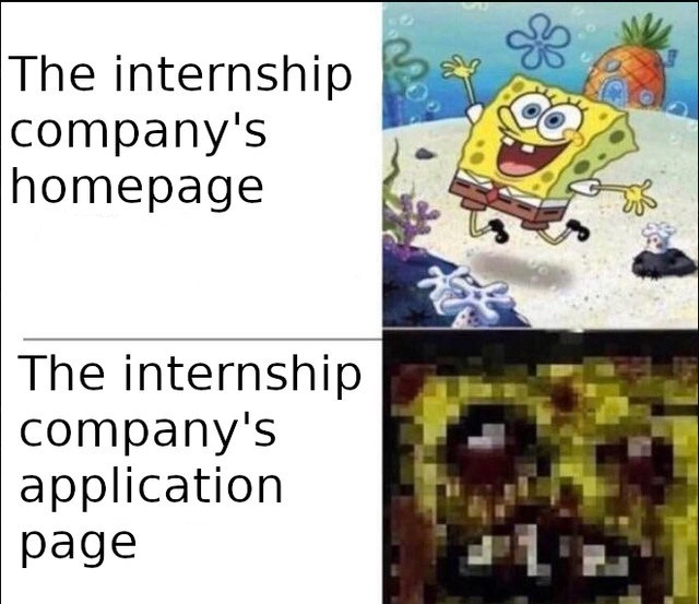
The application page is where the user actually has to do work: fill forms, upload files, answer questions, and submit information. A bad application page might be slow, confusing, ugly, inaccessible, or inconsistent with the rest of the site. That is why the bottom SpongeBob is distorted: the experience feels damaged compared with the clean top image.
For someone applying to internships, this can be especially frustrating. You may be nervous, trying to make a good impression, and then the website itself becomes the obstacle. The meme uses InconsistentUIs and UXFailures to point out that good design is not just decoration. It matters most when the user is doing something important.
Level 3: Vendor Iframe Energy
The meme's two labels do almost all the work: > "The internship company's homepage" sits beside a bright, clean SpongeBob image, while > "The internship company's application page" sits beside a dark, crushed, pixelated SpongeBob. The contrast is not subtle, which is exactly why it lands. Companies often spend real design energy on the public-facing pitch, then route applicants into an abandoned form, a third-party applicant tracking system, or a brittle workflow that feels like it was last QA-tested during a hiring freeze.
This is a sharp UX_UI and Career_HR joke because recruiting pages are marketing surfaces, while application pages are operational surfaces. The homepage gets brand photography, responsive spacing, carefully edited copy, and a product-manager-approved conversion funnel. The application page gets required fields that reset on validation error, resume uploaders that reject normal PDFs, location dropdowns with 900 options, and a login wall for a job the applicant has not even applied to yet. Somewhere, a design system is weeping in a Figma file nobody shared with the vendor.
For internship candidates, the pain is amplified. Juniors are told that attention to detail, accessibility, and polish matter. Then the first technical interaction with the company is a form that violates those values. The joke is not only "bad website funny"; it is the mismatch between CareerExpectations and DeveloperExpectationsVsReality. A company can claim it values user empathy while making users retype their entire work history after uploading a resume containing the exact same information. That contradiction has been in production for years, naturally.
The image also hints at a broader frontend anti-pattern: disconnected ownership. The homepage may be owned by marketing, the application system by HR, the design language by product, and the integration by one engineer who left in 2018. No single team feels the full candidate journey, so the polished first impression and the broken second step coexist like two unrelated products wearing the same logo.
Description
A two-row SpongeBob comparison meme contrasts two parts of an internship company's website. The top row reads "The internship company's homepage" and shows a bright, happy, clean image of SpongeBob running; the bottom row reads "The internship company's application page" and shows a dark, heavily pixelated, distorted SpongeBob image. The joke is that recruiting and marketing pages often look polished, while the actual application workflow, forms, or applicant tracking system feel neglected, broken, or hostile to users.
Comments
2Comment deleted
The careers page got the design system; the application form got whatever escaped the vendor iframe in 2011.
Made with ❤️ by interns Comment deleted