Skip to content
DevMeme
5875 of 7435
A very optimistic Bitcoin price prediction
Blockchain Post #6434, on Nov 28, 2024 in TG

A very optimistic Bitcoin price prediction

Why is this Blockchain meme funny?

Level 1: Tower of Blocks Tumbles

Imagine you’ve built a tall tower out of toy blocks. It’s standing proudly, and everyone thinks it’s solid and won’t fall. But then you remove one little block from the lower part of the tower – just a tiny change – and suddenly the entire tower comes crashing down in an instant! Blocks scatter everywhere. That huge, sudden collapse from one small tweak is what’s happening in this joke. It’s like saying: “We thought everything was stable and strong, but one tiny thing went wrong and boom! – the whole thing fell apart.” It’s funny in a surprising way, because nobody expects a small change to cause such a big disaster so quickly. The meme is basically laughing at how a little mistake can make a big project fall down as dramatically as a toppled tower of blocks.

Level 2: Chart Crash Course

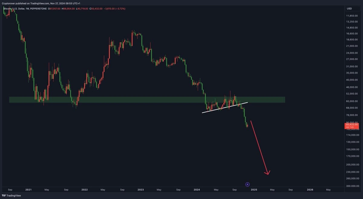
In this meme, the image is literally a Bitcoin price chart from a trading platform (TradingView) being used as an analogy for a developer’s monitoring metrics dashboard. Let’s break down what’s in that chart and why it’s compared to a tech scenario:

  • Candlestick chart – The graph with red and green bars is a candlestick chart of Bitcoin’s price over time (each candle likely represents one week, since it’s labeled “1W”). Each candlestick shows four key values for that week: the opening price, the highest price, the lowest price, and the closing price. If the candle is green, it means the closing price was higher than the opening price (price went up that week). If it’s red, the price dropped that week. The thin “wicks” on each end of a candle show the full range (high to low) that the price touched during the week. This style of DataVisualization is common in FinTech and trading for showing how prices move with ups and downs.

  • Support level (the green zone) – The horizontal green rectangle drawn around $50,000–$60,000 marks a support level on the chart. In trading lingo, a support level is like a price floor that an asset has trouble falling below. It’s a zone where, historically, lots of buyers stepped in to prop up the price, so it tended to “bounce” back up from there. In the image, Bitcoin had previously treated that 50–60k range as a bottom (support) during its earlier corrections. The meme highlights this area to show that everyone assumed “it won’t go below here” — until it did.

  • Uptrend line (the white diagonal line) – That white upward-sloping line connects a series of higher lows in the Bitcoin price. It’s showing an uptrend, meaning each downturn in price was still ending at a higher point than the last. Traders draw these lines to visualize momentum: as long as the price stays above that line, the uptrend is intact and things are optimistic (bullish). It’s basically an optimistic guide rail. In our context, think of it like your system metrics showing improvement week over week — for example, maybe each week your website could handle a bit more traffic without slowing down, so you felt confident things are scaling well.

  • Breaking support (the big drop and red arrow) – In the chart, Bitcoin’s price not only slips below that white trendline (signaling the uptrend is broken), but also crashes through the green support zone. This is what’s jokingly called a catastrophic support break. When a support level fails in trading, it often triggers panic-selling, because people who were counting on that “floor” suddenly realize there’s nothing holding the price up. That’s why the meme shows a long red arrow plunging downward from the breakdown point – implying the price is headed much lower now that the floor fell out. This whole visual screams “major bearish breakout,” which is trader-speak for “the bad times are here.” It’s dramatic, but that’s the point.

Now, how does all that relate to a developer’s life and metrics? Imagine you’re a developer looking at a dashboard of your application’s performance or health metrics (perhaps in a tool like Grafana or CloudWatch). These metrics could be things like: the number of active users on your site, requests per second your API is handling, average response time, or error rate. Ideally, you want most of these lines to either remain stable or move in a good direction (for example, higher throughput is good, lower error rate is good).

Suppose your user traffic has been steadily rising every month – that’s like an uptrend in your metrics chart. You might even draw an imaginary line through the low points of the traffic graph and say, “Look, even our slow weeks are busier than the last, we’re on an upward trend!” That’s your optimistic trendline in engineering terms. Similarly, you may have a baseline number of users or a performance level that you’ve never seen drop below, kind of like a support level. For instance, “We’ve never had fewer than 50,000 daily active users in the past year” could be a support-like assumption. It gives you confidence that no matter what, you’ll at least have that many users or a certain baseline of throughput.

Now enter the minor config change. This could be anything: maybe you updated a library, changed a database index, tweaked a server setting, or rolled out a “small” feature update. It was supposed to be routine and low-risk. But unbeknownst to you, this change has a nasty side effect — say it accidentally turned off a caching layer, or introduced a subtle memory leak, or messed up how user logins work. Suddenly, one of those beautiful metrics on your dashboard takes a sharp turn for the worse. Perhaps the number of active users plummets (because users can’t log in anymore), or your requests per second drop (because the system is slow and users give up), or the error rate shoots sky-high. On a graph, any of those would appear as a sudden vertical movement, the kind that makes your heart skip a beat.

The reason the meme is funny to developers is that the pattern in the Bitcoin chart is exactly what that kind of sudden metric failure looks like. That green support zone you thought was rock-solid — “we’ll never go below 50k users, right?” — gets shattered when the bug kicks in and now you have maybe 30k users online, meaning a huge chunk vanished. The nice upward trend line of improving performance? Gone, as if someone took an eraser to it; your latest data point falls well below that line, indicating a clear trend reversal from good to bad. It’s the same “uh-oh” feeling a trader has when a reliable stock suddenly tanks without warning.

The term tech debt might come up here as well. Tech debt is a metaphor in software: imagine you take shortcuts in code or quick fixes to meet a deadline – it’s like borrowing time. It “debts” the system with potential problems that will eventually need fixing, just as financial debt must eventually be paid. If you let tech debt pile up, your system becomes fragile. In our scenario, a system with a lot of hidden problems (tech debt) can fail catastrophically from a small trigger – similar to how an overhyped market (like a crypto bubble) can crash hard when confidence is shaken. That minor config change was the trigger that exposed all the underlying issues, causing a dramatic collapse in performance (just like a tiny bit of bad news can pop a speculative bubble, sending the price crashing).

So, essentially, this meme uses a dramatic Blockchain market crash image to humorously illustrate what it feels like when a developer’s project hits a sudden crisis. It’s taking a page from cryptocurrency world volatility to say: “one tiny change, and look how my system crashed!” For a junior developer, the lesson (and the humor) is in recognizing that complex systems can behave in unexpectedly volatile ways, not unlike financial markets. Even if you’re not into Bitcoin or IndustryTrends hype, you know the sinking feeling of seeing a graph do the exact opposite of what you wanted. This meme just exaggerates it by saying that feeling is as if your project’s stats were an overvalued coin that just lost its magic support and tanked. It’s a funny (and a little scary) reminder to be cautious with changes, because even “small” tweaks can sometimes send things into a tailspin.

Level 3: Minor Config, Major Crash

It’s one of those facepalm moments every senior engineer recognizes. You check your metrics dashboard after a supposedly trivial config update... and the graph that greets you looks eerily like a Bitcoin price chart in freefall. In the meme image, the candlestick chart (straight out of TradingView) shows a textbook support breakdown: a once-solid support level (the green zone around $50–60k) finally gives way, and the price plummets with a giant red arrow pointing toward oblivion. Swap out price for performance (or uptime, or user traffic) and you have the classic scenario: a minor system tweak shatters the fragile stability, and now your key metric is in a nosedive.

For a battle-hardened engineer, that green support area on the chart is like your system’s comfortable baseline — the level of performance you assumed was safe and stable thanks to all those quick patches and wishful thinking. The upward-sloping white trend line represents our optimistic narrative: “Everything’s fine, look, we’re getting higher lows each week.” But when reality hits – say, that config change accidentally disabled caching or exhausted a database connection pool – boom! The trend line breaks, just as in technical analysis when an uptrend collapses and turns bearish. Suddenly, what was supposed to be a routine Thursday deploy turns into a scene from a crypto market crash: a free-falling metric and an on-call engineer’s heart sinking in tandem. You can almost picture your Grafana dashboard going dark, with alarms screaming, as a big red arrow scribbles itself onto the graph.

It’s darkly funny because we've all been there. One minute you're touting your system’s reliability (maybe even believing your own hype, like a blockchain startup bragging at a FinTech conference), and the next minute you’re staring at a red downward slope so steep it should come with a safety harness. The TradingView-style visualization is perfect parody – as if our dev ops data suddenly decided to mimic a cryptocurrency crash for dramatic effect. The meme basically says: “Remember that unstoppable upward trend in performance you were so proud of? Surprise, it was a bubble poised to burst.” The big red arrow projecting further decline into 2025 feels exactly like those gut-churning moments on call when you’re watching in real time as user counts drop off or error rates explode, and you just know the night is about to get a lot longer.

There’s an underlying truth here about tech debt and overconfidence. All those times we slapped on quick fixes and skipped refactors built up an unsustainable foundation – like an overhyped market with shaky fundamentals. The system’s resilience became a flimsy floor that couldn’t hold forever. That critical support zone (50–60k on the chart; say 50–60% capacity margin in your app) was propped up by luck and band-aid solutions. When one more tiny change came along – the proverbial last straw – it punched right through that floor. What was an optimistic trend of “higher lows” flips into what one might jokingly call a descending hope curve. In trading terms, it’s a bearish breakout; in engineering terms, it’s 3 AM and you’re frantically rolling back to the last known good config.

By blending Blockchain market imagery with a DevOps disaster, this meme hits on an IndustryTrends truth: whether it’s a hyped TechTrends asset like Bitcoin or a proud new app release, things that go up can come crashing down. Seasoned engineers find humor (albeit the kind that makes you sigh) in this parallel. We’ve all shown rosy charts to management — like crypto bros promising the moon — only to eat crow when the “line go up” narrative shatters. That white trend line of progress? Drawn with erasable marker. The green support zone of “it’ll hold”? Pure hopium. Nothing bonds tech folks more than the shared trauma of watching a graph that was steadily climbing suddenly do an impersonation of the 1929 stock market crash – or in modern terms, Bitcoin’s catastrophic nosedives.

Description

A screenshot of a financial chart from TradingView showing the price of Bitcoin (BTC) against the U.S. Dollar. The chart displays candlestick patterns from 2021 to late 2024. The key element of the joke is that the price axis on the right is inverted, with smaller values at the top and larger values at the bottom (e.g., $11,850 at the top, $300,000 at the bottom). A large red arrow points downwards from the current price, suggesting a steep decline. However, due to the inverted axis, this 'decline' is actually pointing towards a massive price crash to a lower value, which is represented by a higher number on the inverted scale. This is a satirical take on technical analysis and the dramatic price predictions common in the cryptocurrency community, humorously forecasting a catastrophic crash under the guise of a chart
Comments

38
Anonymous ★ Top Pick The Y-axis is inverted, just like the logic of anyone who thinks technical analysis on a decentralized asset isn't just astrology for tech bros
  1. Anonymous ★ Top Pick

    The Y-axis is inverted, just like the logic of anyone who thinks technical analysis on a decentralized asset isn't just astrology for tech bros

  2. Anonymous

    Reminds me of the latency graph right after someone said, “Sure, let’s just turn on full debug logging in prod - what could go wrong?”

  3. Anonymous

    Ah yes, the classic 'descending triangle with a side of existential dread' pattern - where your support levels become resistance to your therapist's advice to stop checking the charts every 5 minutes

  4. Anonymous

    This chart perfectly captures the cryptocurrency developer's dilemma: your smart contract might be formally verified and your consensus algorithm Byzantine fault-tolerant, but your portfolio's trajectory still depends on whether retail traders believe a hand-drawn arrow on TradingView. It's like spending months optimizing your distributed system's latency to microseconds, only to discover the real bottleneck is human psychology running on wetware with O(emotional) complexity

  5. Anonymous

    Support held with 99.9% uptime SLA... until the one cascade failure that mattered

  6. Anonymous

    When the roadmap needs a bull market, someone quietly calls invert(y); same helper we use on the 99th-percentile latency graph before the QBR

  7. Anonymous

    Looks catastrophically bearish - until you notice the y‑axis increases downward, the same OKR hack where we invert the metric and call it “up and to the right.”

  8. @Valithor 1y

    This isn't a meme, this is market manipulation. Cease this.

    1. @loomingsorrowdescent 1y

      Crypto is the future of currency bro it's gonna change the world bro just don't shitpost about it too hard bro it's gonna crash the market bro

      1. @Algoinde 1y

        Crypto is the future of currency bro it's gonna change the world bro please shitpost about it bro it's gonna pump the market bro

        1. @tema3210 1y

          Never until I can buy some food with it)

          1. dev_meme 1y

            Sir, but you actually can

            1. @tema3210 1y

              1 place on the earth?

    2. @mpolovnev 1y

      I doubt that a public with 11k members can move the market

      1. @GLXBX 1y

        There are 11000 of us, and we hold 51% of Bitcoin supply

        1. @deadgnom32 1y

          can we just. start buying Bitcoins from each other?

          1. @hy60koshk 1y

            at $10 per coin

          2. @GLXBX 1y

            Transfer fees are crazy in btc network I opt out

        2. dev_meme 1y

          12k already!

  9. @SpYvy 1y

    Is growing!

    1. @ercolebellucci 1y

      You explained how economy works

    2. @HarukiNikaidou 1y

      invert the axis and you will get the chart above🤣

  10. @joyofworld 1y

    Reverse scale is wild

    1. @SamsonovAnton 1y

      Is this legal?

  11. @mitya12342 1y

    Certified market manipulation classics

  12. @Cyntux 1y

    Buy the dip

  13. @deerspangle 1y

    I wish China didn't ban bitcoin mining. They were in such a great position to just seize 51% of the mining hardware and rewrite the "immutable" ledger

  14. @callofvoid0 1y

    numbers increase by going down

    1. @SamsonovAnton 1y

      We call it flipped growth™. By going down, things convert their potential into kinetic energy. ☝️

      1. @callofvoid0 1y

        I mean the chart itself is flipped

  15. @ashit_axar 1y

    Now you need to understand the past to be able to predict the future (history). - Why crypto currency? + Remember market crash in year 2008? People taking their total money out of banks. Banks need the money back. How? Crypto (governments can't track your money, ya) (really? no. that is why crypto currency is made, to track your money and market better)

    1. @TheFloofyFloof 1y

      Except crypto is NOT anonymous and it's much easier to track wallets without being a bank

      1. @Protomax 1y

        It can be easily be anonymous if you know what your are doing

      2. @ashit_axar 1y

        Yup, they can easily track you and your money, that's why crypto currency is born. Because it is hard to track physical money once it leaves the bank. They needed a better way to predict cash flow in the market. Being anonymous nowadays is getting harder and harder.

    2. @TheFloofyFloof 1y

      God reading this. If a bank run happened in crypto unless you were the first to pull your funds out you are losing money while the coin value tanks

  16. @admbeck 1y

    If I buy it then it will crash immediately

    1. dev_meme 1y

      So what? Just hold Whoever bought btc in 4y from the buy was at least in some profit

      1. @admbeck 1y

        It was a joke

Use J and K for navigation