
Tailwind Emerald Status Dot Meme Explained
An Inglourious Basterds three-finger gesture pairs with a tiny emerald pulse status span. The dive explains Tailwind utilities, LLM frontend clichés, and why default design choices become authenticity fingerprints.
Level 1: The Secret Handshake Done Wrong
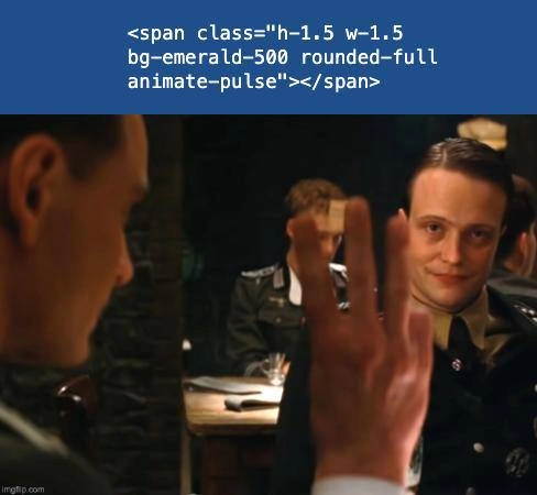
A spy in a movie pretends to be a local, speaks the language perfectly, wears the right uniform — and then orders three drinks using the wrong fingers, the one tiny habit he forgot to fake. Everyone at the table instantly knows. The joke here is that computers that write websites have their own "wrong fingers": a tiny blinking green dot they put on everything they make. So when someone says "I built this website all by myself!" and you spot the little green dot pulsing in the corner... you just smile, like the man in the movie. The dot already told you everything.
Level 2: Utility Classes and the Anatomy of the Dot
Tailwind CSS is a framework where instead of writing CSS files you stack small "utility" classes directly in HTML. Reading the snippet left to right: h-1.5 w-1.5 set height and width (0.375rem each), bg-emerald-500 picks the mid-shade of Tailwind's emerald palette, rounded-full makes a square into a circle, and animate-pulse applies a built-in opacity-fade animation. Together: a little glowing green dot, the universal UI symbol for "system online."
A <span> is the generic inline HTML element — a blank canvas that does nothing until classes give it meaning, which is why it's the natural host for a decorative dot.
The cultural term to know is the "tell": borrowed from poker, it means an involuntary signal that reveals what you're hiding. As AI-generated code floods portfolios and PRs, experienced devs have built mental lists of tells — certain comment styles, certain naming patterns, and above all certain visual clichés. The lesson isn't "never use the dot." It's that defaults are legible: if every choice in your project is the most statistically common one, people can infer how it was made. Change the color. Resize the dot. Order the fourth glass differently.
Level 3: Mode Collapse, But Make It Emerald
The scene is the basement bar from Inglourious Basterds: the undercover British spy orders three glasses with his index, middle, and ring fingers — the British way — and the Gestapo officer across the table smiles, because a German would have used thumb, index, middle. One gesture, cover blown. The meme replaces the order with a caption in monospace on a blue code box:
<span class="h-1.5 w-1.5 bg-emerald-500 rounded-full animate-pulse"></span>
That snippet is a tiny Tailwind CSS status indicator: a 6×6-pixel circle (h-1.5 w-1.5, rounded-full), colored bg-emerald-500, gently throbbing via animate-pulse. Perfectly innocent. Also, at this point, the single most reliable forensic marker that a UI came out of an LLM. Ask any frontier model for a dashboard, a landing page, a SaaS mockup — anything with a "live" or "online" state — and with uncanny regularity you receive this exact span: same size, same utility order, same emerald-500 (never green-500, somehow; the models have taste, and their taste is emerald).
Why does this happen? Because LLMs are trained on the modern frontend corpus — shadcn/ui examples, v0 outputs, a million Tailwind tutorials — and sampling from that distribution collapses toward its dense center. The pulsing emerald dot sits at the centroid of "tasteful 2024 dashboard." Each generation reinforces the next as AI-built sites get scraped into training data, a feedback loop turning a design choice into a fingerprint. The result is the three fingers problem for vibe-coded frontends: you can prompt the model to "make it unique," rename your components, even claim the design took two weeks — but the moment a reviewer's eye catches that soft green heartbeat in the corner of your status badge, they smile exactly like the Gestapo major. You may speak fluent React, but you've just ordered three glasses the wrong way.
The deeper joke is about authenticity detection becoming a skill. Developers now read UIs the way the officer reads gestures — gradient hero text, rounded-2xl cards, a sprinkle of ✨, and that dot — and the tells matter because "handcrafted" still signals care to clients and employers. The irony: the dot is good design. It got popular by being right. The fingerprint isn't a flaw; it's the average of everyone's best practices, which is exactly what a language model is.
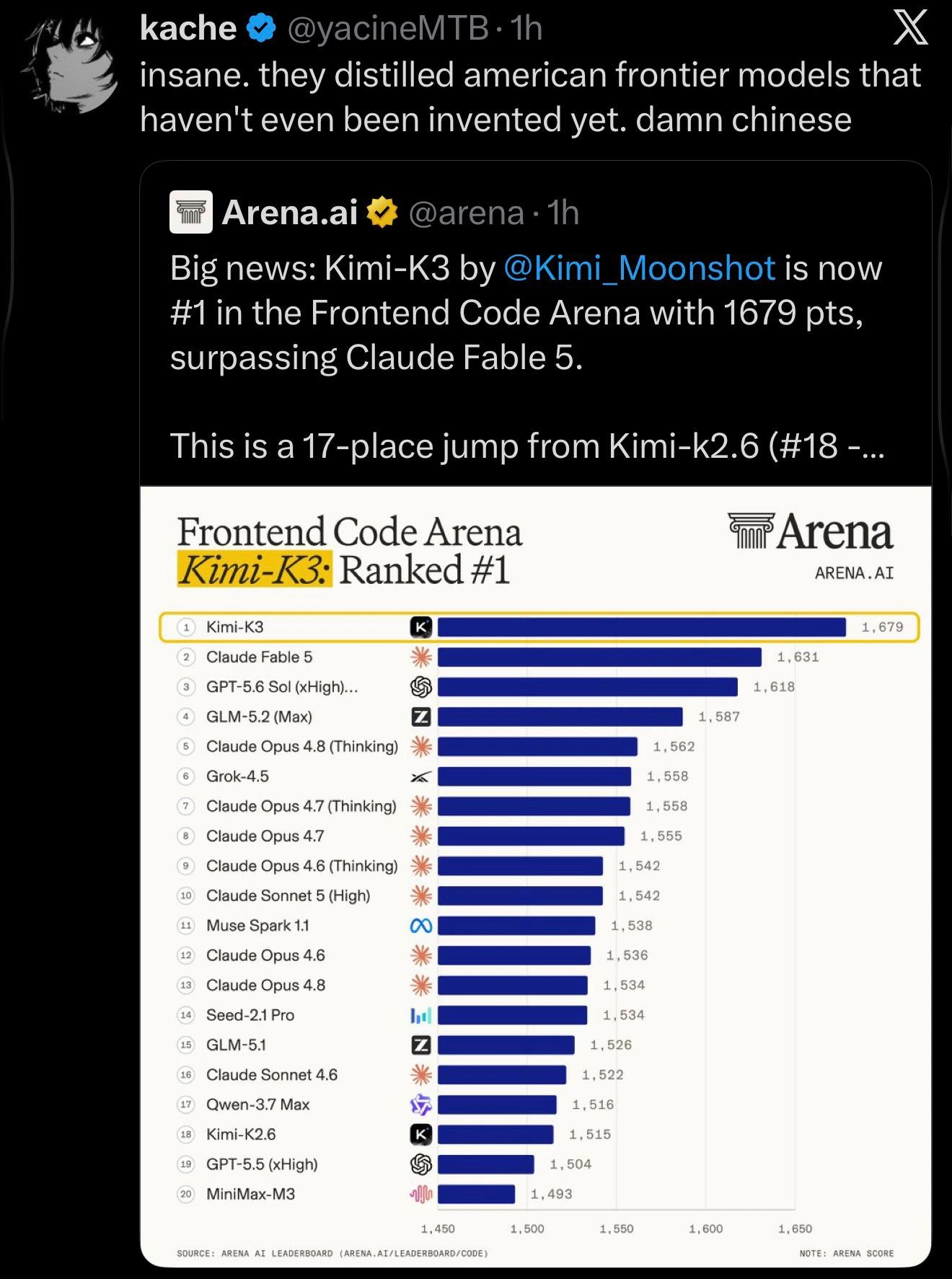
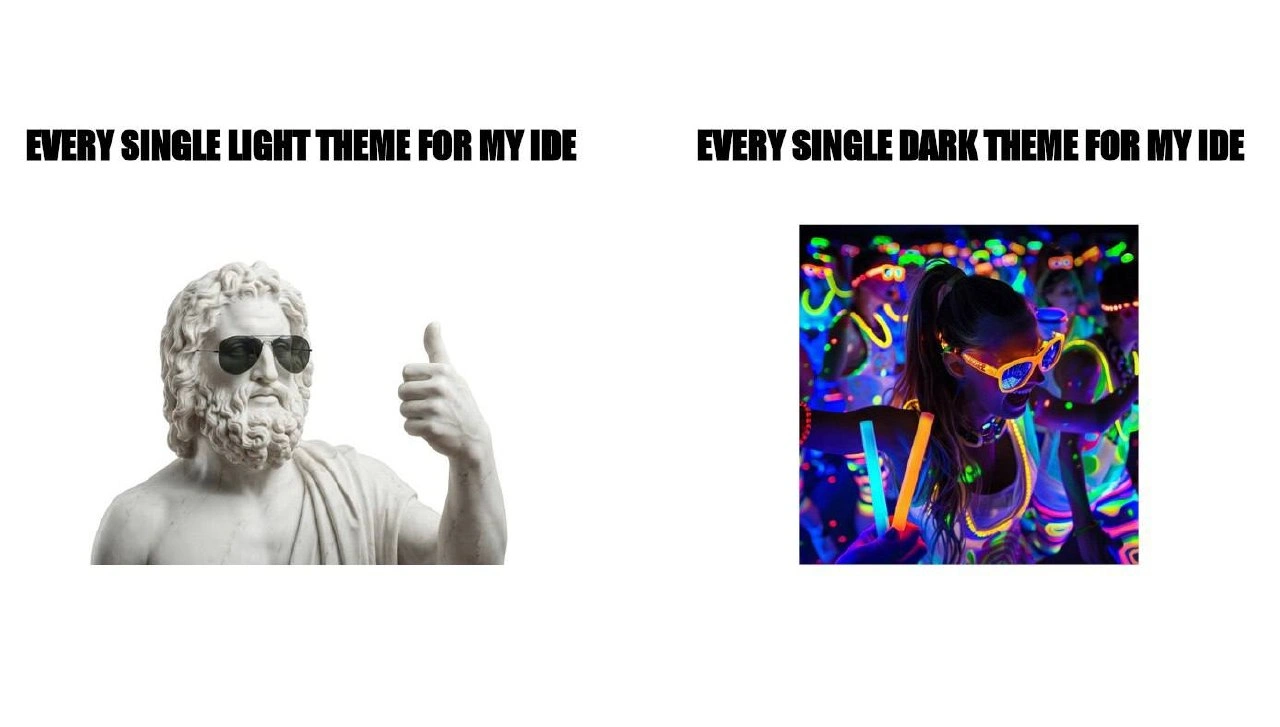
You may speak fluent React, but the moment your status indicator pulses emerald-500, everyone at the table knows who really wrote your components
The implementation passed review; `animate-pulse` failed the identity check.
gap-x-2 items-center justify-self-end z-1488 bg:red-400 hover:bg-red-600 active:text-[var(--active-foreground)]
i dont speak tailwind or whatever this poop is
Don't get used to it guys
Just fukken kill it (No rly, I don't understand what shitbrains use tailwind with vue3. With all the css sections we gave them -.-)
Can someone explain it for non-webdev?
https://platform.censys.io/search?q=web.endpoints.http.body%3A+%22rounded-full+bg-emerald-400+animate-pulse%22
Could have just used style="...shit..." with the same content almost
For non-webdevs it really looks like (it's written "sysadmins' sense of humour")
Impressive. Very nice. Now let's see the CSS alternative.