
Tailwind Utility Classes Meme Explained
A tweet turns “Tailwind who?” into paragraphs of utility classes. The dive explains utility-first CSS, why markup gets verbose, and the productivity-versus-readability trade-off frontend teams know well.
Level 1: The Never-Ending Answer
Imagine you’re telling a knock-knock joke and expect a quick, funny answer. You say, “Who’s there?” and instead of a simple name, the person behind the door starts giving you way too much information: “It’s me, your friend, I’m wearing a blue shirt with white stripes, I tied my shoes with a double knot, I walked up 12 steps to get here…” and on and on! You’d probably start laughing because it’s so silly and unexpected. They were just supposed to say their name, right?
That’s exactly the joke in this meme. The setup is normal – Knock knock. “Who’s there?” “Tailwind.” “Tailwind who?” – but then the answer isn’t a name or a simple phrase. It suddenly turns into a massive block of text full of what looks like random words and codes. It’s as if Tailwind (which is a toolkit for styling websites) decided to list out everything about itself instead of just answering the question. Even if you don’t understand those technical words, you can see that the answer is ridiculously long. It’s like asking a simple question and getting an answer that reads like an entire instruction manual!
The reason it’s funny is because of that huge mismatch between expectation and answer. In a normal knock-knock joke, the punchline is quick. Here, the punchline keeps going and going, so much that it overflows the joke. Tailwind in this meme is like a friend who just can’t give a simple answer – they have to include every little detail. That over-the-top response is what makes people laugh. You expect a quick laugh, but instead you’re overwhelmed by a torrent of silliness. The surprise of getting such a never-ending answer is the heart of the joke.
Level 2: Unpacking Tailwind’s Class Wall
Let’s break this down. CSS (Cascading Style Sheets) is how we style HTML elements with colors, spacing, fonts, etc. Normally, a developer might give an element a simple class name and then write the styling rules for that class in a separate CSS file. For example, you might have HTML like <button class="primary-button">Click me</button> and in your CSS file you define what .primary-button should look like (say, blue background, white text, padding, rounded corners, etc.).
Tailwind CSS takes a different approach called utility-first CSS. Instead of using a descriptive class name like “primary-button”, you directly apply lots of small classes (utilities) that each do one specific thing. For instance:
px-4— add horizontal padding (left/right) of a certain size (the “4” in Tailwind usually corresponds to 1rem, about 16px).py-2— add vertical padding (top/bottom) of a smaller size (the “2” is 0.5rem, about 8px).bg-blue-500— make the background color a medium blue (Tailwind uses numbers like 500 to indicate the shade).text-white— make the text color white.rounded-md— give the element moderately rounded corners.hover:bg-blue-700— on hover, change the background to a darker blue (700 is a darker shade in the palette).
So if you wanted a blue button with white text using Tailwind, your HTML might look like:
<button class="px-4 py-2 bg-blue-500 text-white rounded-md hover:bg-blue-700">
  Click me
</button>
There’s no separate CSS definition for .primary-button here – you’ve described the look entirely with Tailwind’s utility classes in the class attribute.
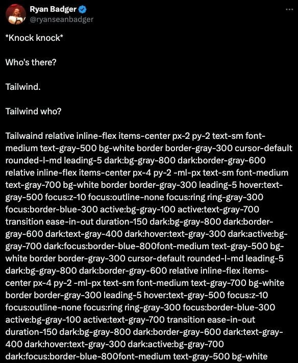
Now, the meme shows a tweet screenshot where a knock-knock joke’s punchline is replaced by a gigantic string of Tailwind classes. The text in that image (like relative inline-flex items-center px-2 py-2 text-sm font-medium text-gray-500 bg-white border border-gray-300 cursor-default...) is an exaggerated example of what Tailwind usage can look like. Let’s decode a few from that wall of classes:
relative– sets the element’s position to relative (so it can contain absolutely positioned children).inline-flex– makes the element an inline-level flexbox container (so it behaves like an inline element but its contents are laid out with flexbox).items-center– a flexbox utility that centers children vertically within the flex container.text-sm– small text size (slightly smaller than default).font-medium– a medium font weight (semi-bold text).text-gray-500– medium gray text color.bg-white– white background color.border border-gray-300– a border with a light gray color (the classbordersets a 1px solid border, andborder-gray-300gives it that gray shade).cursor-default– shows a default arrow cursor (indicating this element isn’t clickable, perhaps).rounded-l-md– medium rounded corners on the left side of the element (maybe it’s the leftmost item in a group, so only the left corners are rounded).leading-5– sets the line height (vertical spacing of text lines) to a size 5 (around 1.25rem, for consistent text spacing).dark:bg-gray-800 dark:border-gray-600– these are dark mode variants. They mean if the page is in dark mode, use a dark gray background (#1F2937) and a slightly lighter dark border. Tailwind’sdark:prefix is a built-in way to apply alternate styles when a dark theme is active.
And the tweet shows even more classes beyond these! Essentially, the answer “Tailwind who?” in the joke turned into a huge list of style classes. Even if you don’t recognize each class, you can tell it’s a lot. The meme is exaggerating how using Tailwind can make a single HTML element carry a ton of stylistic information. The short setup text at the top of the tweet (the knock-knock part) gets completely overshadowed by the dense block of Tailwind classes in the punchline.
For a newer developer, here’s why that’s funny: Tailwind is supposed to make it easy and quick to style things because you don’t have to come up with CSS rules or names – you just pick from ready-made utility classes. And it does make building UIs pretty fast. But the trade-off is that your HTML markup can become cluttered with class after class. It’s like writing out the recipe for a dish every time you serve it. Imagine if, instead of just calling something “pizza”, you had to list all the ingredients and steps whenever you talked about it: “flour-water-yeast dough, flattened, spread with tomato sauce, topped with mozzarella, baked at 400°F for 15 minutes”. Useful instructions, but quite verbose for daily conversation! In the same way, Tailwind’s method means each element lists all its styling ingredients right there.
The meme nails this concept with a knock-knock joke format. We expect the punchline to be short, maybe just one word or a simple phrase. But Tailwind, being a tool that encourages lots of details inline, “responds” with a ridiculously long string of details. The contrast is what makes it funny. It highlights a real-world coding situation (Tailwind’s verbose class lists) in a very exaggerated, comedic way. The categories here are “Frontend” (because it’s about front-end web code), “Developer Experience” (because it affects how developers write and read code), and “UX/UI” (even though the user interface result might be fine, the way we achieve it has its own user—developer—experience). In short, the meme is playfully showing how a simple question can get a hilariously complicated answer when Tailwind is involved.
Level 3: Punchline Buffer Overflow
The humor here lands squarely on the overkill inherent in Tailwind’s utility-class approach. A knock-knock joke is supposed to end with a short, snappy punchline. Instead, “Tailwind who?” opens the floodgates to a wall of class names, completely overwhelming the format of the joke. For seasoned frontend developers, this scenario is hilariously relatable: it’s the absurd exaggeration of what we see in real projects. We’ve all opened an HTML or JSX file to fix a padding issue and been confronted with something like:
<button class="relative inline-flex items-center px-4 py-2 -ml-px text-sm font-medium
             text-gray-700 bg-white border border-gray-300 hover:text-gray-500 focus:z-10
             focus:outline-none focus:ring focus:ring-gray-300 focus:border-blue-300
             dark:bg-gray-800 dark:border-gray-600 ...">
  Load More
</button>
(Yes, that’s all on one element!)
In practice, a simple button can become an eye-chart of utility classes as seen above. The meme exaggerates it to paragraphs of classes as a comedic extreme, but it resonates because the core truth is there. Utility-first CSS means you’re describing every detail of the styling in the HTML. Senior devs chuckle (or cringe) at this because it reminds them of maintaining code where the actual content gets drowned in presentation details. It’s as if the punchline (the meaningful part, like the button text or the joke’s answer) is buried under an avalanche of micro-instructions on how to render it.
This joke also pokes at the ongoing semantic vs. utility CSS debate. Traditionally, you might give an element a neat class name like class="primary-button" and define the styles in a separate CSS file. That keeps HTML clean and focused on meaning. Tailwind trades that for speed: semantics are sacrificed for rapid building blocks. The tweet’s giant class list is essentially a roast of how far that trade-off can go. It’s funny because it’s true – Tailwind can make something as trivial as a knock-knock punchline turn into a verbose style checklist.
Experienced developers know the pain and gain here. On one hand, using Tailwind can be amazingly productive: you get consistent spacing, color schemes, responsive variants, and dark mode styling (as those dark: classes in the meme show) with minimal fuss. No more inventing class names like .btn-primary or wrestling with CSS specificity – you just stack pre-made classes. It’s like building with LEGO pieces: quick to assemble, highly consistent, and no single piece is too complex. But when you use 30 tiny LEGO pieces to build what could have been one big piece, you end up with a very long assembly manual. Reading or revisiting that code can feel like deciphering a class name cryptogram, especially for someone who didn’t construct it.
The meme’s format (a tweet) is a nod to how widely recognized this problem is. It’s a community in-joke. When Ryan Badger sets up “Tailwind who?”, everyone in the know expects some quip about class bloat. The hilarious payoff is that he actually prints out that bloat in full as the punchline. Developers who have dealt with this kind of class overload can’t help but laugh and groan at the same time – it’s a “so true, it hurts” kind of laugh. The DeveloperExperience_DX irony is palpable: Tailwind improves one aspect of DX (speed of development and consistency), but can hurt another (readability and maintainability of code). This tweet-meme distills that irony into a classic joke format – and then promptly blows up the punchline buffer with too much output, exactly like a misconfigured log or an overeager config dump spewing text in your terminal.
In essence, the senior perspective here is both a laugh and a lesson. It’s acknowledging the trade-off every tool brings. Tailwind simplifies writing styles by giving you robust building blocks, but the consequence is an explosion of those blocks in your markup. When not kept in check, it leads to what we see in the meme: a comically verbose “answer” where a simple name would do. It’s a gentle ribbing of modern frontend practices – a reminder that even as we solve old problems (goodbye, cascade conflicts and naming things), we introduce new quirks (hello, massive class attributes). Like any good inside joke among developers, it’s funny because it rings true.
Level 4: Combinatorial Class Explosion
Tailwind CSS’s utility-first design hints at a deeper combinatorial phenomenon. Each tiny class (like px-2 or text-gray-500) acts as a basis vector in the space of visual styles. To build a complete UI element, developers combine numerous such basis vectors. This is conceptually similar to expressing a complex signal as a sum of simple frequencies – a Fourier series of CSS. The punchline avalanche we see in the meme is like a Fourier series with dozens of terms: technically precise, but overwhelming to read in raw form.
Under the hood, Tailwind CSS pre-generates thousands of utility classes covering every permutation of spacing, color, font, and state. It programmatically creates variants for different conditions (hover:, focus:, sm:, dark: modes, etc.), which multiplies the total class count. This approach flirts with a combinatorial explosion: for example, 10 base style options with 5 variant prefixes yield up to 50 classes. Tailwind tames this explosion by “purging” unused classes from the final stylesheet, ensuring your browser only loads the classes actually used in the HTML. It’s a bit like generating a huge dictionary of words but only publishing the pages people actually look up. Still, during development that dictionary exists, and any given UI element might pull in entries from many different pages at once.
There’s a theoretical trade-off here between separation of concerns and inline specification. Classical web design preaches separating HTML (structure) from CSS (presentation) – you keep style rules in a stylesheet, avoiding mixing them with content. Tailwind’s utility approach upends this by collocating style instructions directly in the markup. It’s reminiscent of embedding assembly instructions in high-level code for fine-tuned control: you gain precision and eliminate indirection, but at the cost of a more verbose “machine-level” listing. In exchange for that verbosity, you sidestep CSS’s cascade and specificity pitfalls. Each class is independent and immutable in effect, analogous to functional programming where small pure functions (here, small single-purpose classes) compose together without side effects.
So when “Tailwind who?” triggers a wall of classes, it’s humorously illustrating an expansion strategy common in computing: a tiny input (the word “Tailwind”) unravels into a huge output (all those classes). In compilers, a simple macro can explode into many lines of code; in config management, a single variable can unroll into a complex setup. Here, the joke is that asking Tailwind for its identity results in it dumping its entire style repertoire at once. It’s an absurd demonstration of how a utility-first CSS philosophy, grounded in the idea of composing small pieces, can lead to unexpectedly large representations. The math and mechanics of Tailwind’s design aren’t flawed – they’re intentionally like this – but seeing the raw output without abstraction can feel like drinking from a firehose.

That's not a punchline, that's my JSX component after a junior dev discovers that `@apply` is 'against the rules'
Tailwind code review: 3,428 changed characters, zero changed behavior - just the designer pivoting from gray-500 to gray-400 and my diff tool crying in utility-first Morse code
The real joke is when you realize this Tailwind class string is still shorter than the webpack config you need to optimize it for production, and both are more readable than the CSS-in-JS solution your team settled on after three architecture meetings
This perfectly captures the Tailwind paradox: you save time not context-switching to CSS files, but spend it scrolling horizontally through class names that read like a regex pattern had a baby with a design system. Senior devs know the real punchline comes during code review when someone asks 'could we extract this into a component?' and you realize you've just reinvented CSS classes with extra steps
Tailwind: Accelerating prototypes while dooming enterprise code reviews to horizontal scroll marathons
Tailwind who? Tailwind - the only framework where a button’s className is longer than the feature spec and the PR diff doubles as the style guide
Tailwind: we solved naming things by memorizing a 200-character spell - PurgeCSS is thrilled, code reviewers and human L1 caches are not
f*ck tailwind all my homies use fomantic
someone needs to invent an external file where you could save your tailwind class combinations under a specific name and reference them within your markup with just an identifier. you could even make it so you can combine them!
You can only understand Tailwind's simplicity by using it Abstracting is also a thing the op clearly doesn't understand
no more !important rules 🙃
but somehow still bad to use the builtin color="" attribute of HTML elements