
Shared Dependency Outage Meme Explained
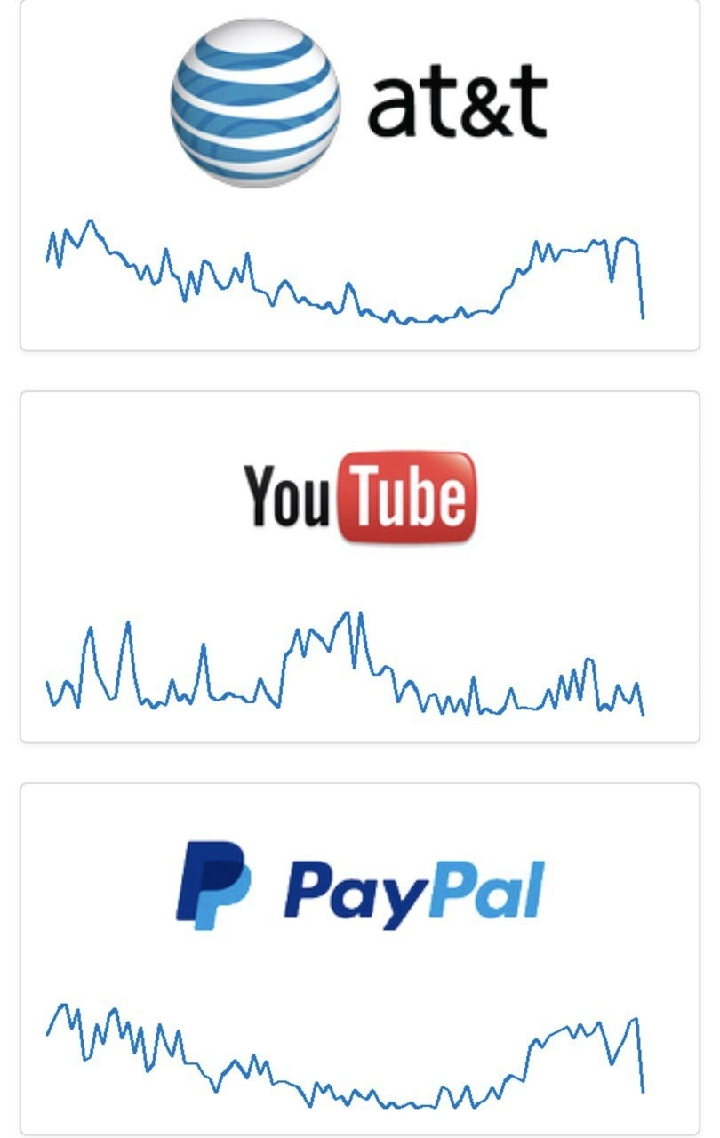
Three big brands show the same jagged downtime chart. The deep dive covers common-mode failures, cloud and backbone SPOFs, DownDetector-style correlation, and why simultaneous outages wake the pager.
Level 1: All the Lights Go Out Together
Imagine you’re at home and suddenly the power goes out on your entire block – your house, your neighbor’s house, and even the traffic lights on the street all go dark at the same time. It’s not just your TV or your fridge that stopped working; everyone’s did, all at once. What would you think? You’d realize the problem isn’t with your individual house – likely a main power line or the neighborhood transformer went down, causing a blackout for everyone. This meme is joking about the same kind of thing, but with internet services. Three big companies had their “lights” (servers) go out simultaneously because they all depended on the same “power source” (some important part of the internet) and that source failed. It’s funny in a cheeky way because the people who keep these services running (like the electricians of the internet world) see this and go, “Uh-oh, the whole grid is down.” It’s a bit like if three huge grocery stores in different towns all closed at the exact same time – you’d suspect something bigger, like the highway they all use for deliveries collapsed. Here, the engineers are seeing three big websites acting lifeless in unison and thinking, “Yep, something big broke that’s out of our control.” The humor comes from that mix of surprise and shared pain – it’s a scary situation, but at least everyone’s in the dark together, literally!
Level 2: Not Just You
For a newer developer or someone just learning the ropes, let’s break down what’s happening. We have three famous company logos – AT&T, YouTube, and PayPal – each shown above a squiggly blue line graph. Those graphs look almost identical: they rise and fall in the same places and then all drop off a cliff at the end. What are these graphs? They resemble the kind of charts you see on outage tracking websites like DownDetector or on internal monitoring dashboards. Essentially, they’re showing a surge of problem reports or error rates over time. A typical pattern for an outage graph is a sudden spike (as many users start reporting issues or as systems start failing), maybe some wobbly attempts at recovery, and then either a return to normal or a flatline if things totally died. In this meme, all three graphs have the same shape, meaning all three services likely experienced trouble at the exact same time.
Why is that significant? Well, AT&T is a telecom company (think cell phone and internet provider), YouTube is a video streaming platform, and PayPal handles online payments. Normally, an issue in one shouldn’t instantly affect the others; they run different systems. If all three went down together, it hints that they share some common service or network. In practical terms, maybe they rely on the same cloud provider or data center, or perhaps a major network cable or router that carries traffic for all of them had a failure. For example, if an important internet backbone (the big infrastructure that carries data across the country/world) broke, users wouldn’t reach AT&T’s services, YouTube videos, and PayPal transactions – all at once. Likewise, if a crucial DNS service (which is like the internet’s phonebook) went down, your computer wouldn’t know how to find the servers for those companies, making them all appear offline. Essentially, this is a simultaneous downtime pattern: multiple things failing in the same way at the same time, because something they all depend on broke.
From an observability and monitoring systems perspective, engineers and SREs (Site Reliability Engineers, the folks responsible for keeping services running smoothly) watch graphs like these to detect problems. If you’re on on-call duty (meaning it’s your turn to be paged if something goes wrong in production), a graph nosediving to zero or spiking uncontrollably is your cue that something’s very wrong. Tools like PagerDuty or other alerting systems will notify the on-call engineer, often with a loud alarm or buzz, that an incident is happening. Now, imagine you’re that on-call engineer: your phone blows up at 3 a.m., you rub your eyes, check the dashboard and… you see not only your service, but several major services all showing error spikes. At first you might be confused – “Did I just break the entire internet?!” (Don’t worry, you didn’t.) Then it clicks: “Oh, this is a broad outage. It’s not just us – it’s affecting many companies.” This realization is important. It means the root cause is likely something bigger than your application’s code – for instance, a widespread cloud outage or a network issue.
For a junior dev, think of how you might check if an issue is on your side or everyone’s side. You might ask, “Is this website down for everyone, or just me?” There are even websites that let you check that. DownDetector is one such site where users report outages; if thousands of people suddenly report YouTube is down, you know it’s a general problem. In the meme’s image, seeing the same weird graph for multiple services side by side is like a big red flag: it’s not a coincidence, it’s a big event affecting multiple companies. The humor here is in the absurdity – it’s quite rare yet every experienced dev has seen it happen at least once: an entire chunk of the internet blinks out. For a newcomer, it’s a lesson that even huge companies rely on common infrastructure. No one is truly isolated out there; if that common piece fails, a lot of things can fail together. And yes, the poor engineers will have to scramble to respond, coordinate with others, and update status pages, all while knowing a million users are out there saying “Why can’t I watch my videos or use my payment?!”. In summary, the meme is showing a multi-service outage visual: three big-name platforms all showing the same outage fingerprint, a scenario that immediately tells developers, “This is a big internet problem, not just a small bug in one place.”
Level 3: One Outage to Rule Them All
This meme lands squarely in the SRE humor wheelhouse by showing three huge services – AT&T, YouTube, and PayPal – all face-planting with the exact same outage graph. For seasoned engineers, that’s the telltale sign of a shared dependency failure. The joke is that these companies aren’t supposed to go down together; they operate in totally different domains (telecom, video streaming, online payments). If they all crater at once with matching wobbles and drops in their monitoring charts, something big and external must have gone wrong. It could be a cloud provider outage (like when an AWS region or Google Cloud hiccup wipes out many services at once) or a major internet backbone issue (for instance, a tier-1 network going down or a central DNS service failing). In practice, SREs recognize this scenario from those infamous days when the internet itself seems to be on fire. The humor (laced with PTSD) comes from the absurdity and familiarity of it: you’re on call, your pager is blowing up, and you frantically check multiple monitoring systems only to realize the whole world is burning down, not just your app. This image basically screams “DownDetector bingo!” – when you open that site during an incident and see half the internet’s top logos lit up with outage reports, you know it’s going to be a long day (or a very sleepless night). The meme captures that moment of twisted relief and dread: relief that it’s likely not your code causing the issue (“phew, it’s not just our service!”), and dread because if giants like YouTube are down, you’re dealing with a massive infrastructure meltdown you probably can’t fix yourself. It satirizes the fact that in modern systems, everything is connected. We preach about redundancy and no single point of failure, but then many companies still rely on the same handful of cloud providers, CDNs, or DNS services behind the scenes. So a failure in one of those shared services triggers a cascading outage – multiple independent status pages all turning red simultaneously. Senior devs have seen this happen in real life: one misconfiguration or DDoS attack on a core service and suddenly Slack, Spotify, Netflix, and half the internet go dark in unison. It’s the ultimate OnCall_ProductionIssues nightmare – you can’t even call support because, guess what, the telecom carrier is down too! The meme’s three-panel alignment also pokes fun at how engineers obsessively correlate graphs during incidents. SREs and on-call engineers live in dashboards and Observability_Monitoring tools; when all your charts have the same freaky waveform – a spike of doom followed by a flatline – you’ve confirmed it’s not an isolated bug. That pattern is essentially the fingerprint of a widespread outage. And for the battle-scarred ops folks, it triggers flashbacks: the PagerDuty alerts from multiple systems all firing at once, the Slack war room filling up with “Anyone else seeing this?”, the frantic scramble to find out which upstream provider screwed up this time. There’s even an unwritten rule in ops: if you suspect a major internet issue, you check Twitter or DownDetector before tearing apart your own code. The meme visualizes that shared experience – three big brands all tanking together is basically the “it’s not just us” signal. But it’s a cold comfort, because you still have to deal with user complaints and management breathing down your neck. In the end, the meme is both a chuckle and a groan: a chuckle at the surreal sight of simultaneous downtime across unrelated services, and a groan because every seasoned dev knows that means nobody is sleeping tonight. It’s a wry commentary on cloud-era infrastructure: we’ve built incredible systems on top of a few critical foundations, and when those foundations crack, we all fall down together – cue the SRE nightmare scenario.
Level 4: BGP Domino Effect
At the deepest level, this meme hints at how independent internet giants can topple together due to a single critical infrastructure failure. The identical jagged graphs suggest a common-mode failure – a hidden single point of failure (SPOF) underlying AT&T, YouTube, and PayPal. In global networking theory, this often means something like a BGP route leak or a major DNS outage. BGP (Border Gateway Protocol) is the internet’s fragile traffic control system – if one ISP (like AT&T) misfires a route advertisement, it can blackhole traffic for many services at once, creating a domino effect. Think of a bad BGP update propagating across routers worldwide, suddenly making multiple services unreachable in synchrony. Likewise, a DNS meltdown at a top provider (e.g. a massive DNS DDoS or a cloud DNS misconfiguration) could simultaneously bring down seemingly unrelated services because they all rely on the same name resolution backbone. These scenarios illustrate deep distributed systems realities: even in a decentralized network, there are choke points (Internet backbone links, DNS root servers, core Tier-1 ISPs) where a failure ripples outward. The meme’s tri-graph alignment is essentially a blueprint of a cascading failure in real time – the kind of event that keeps systems theorists and SREs awake at night (literally). It’s a graph shaped by the unforgiving math of uptime: if $P(\text{outage})$ for one service is low, the probability of three independent ones tanking in lockstep should be astronomically lower… unless they share an unseen dependency. In reliability engineering terms, this is a correlated failure obliterating the assumption of independent uptime. The humor here is darkly academic: our observability tools (like these charts or DownDetector) expose the inconvenient truth that the cloud has dark, interconnected underbellies. The internet’s backbone might be robust in design, but when it breaks, it breaks spectacularly – as evidenced by that synchronized cliff-drop in all three graphs. And of course, it always happens at the worst time (cue the 3 AM PagerDuty chorus). The meme is basically a spectral plot of a global outage scenario that you’d find analyzed in post-incident retrospectives and network architecture journals – except distilled into one brutally simple visual gag.

The marketing team's ultimate KPI is when the Grafana dashboard for user engagement perfectly traces the company logo. The engineering team just calls that a sign the monitoring agent is stuck in a loop
Those identical downdetector squiggles are the universe’s way of reminding us that “multi-cloud” is just Latin for “we all share the same BGP leak.”
After 20 years in tech, I've learned that the only difference between a service's status page showing '99.99% uptime' and these graphs is that one of them is honest about what your on-call rotation actually feels like
YouTube's uptime graph looks like it's running on a Kubernetes cluster managed by a junior dev who just discovered horizontal pod autoscaling but forgot about resource limits. Meanwhile, AT&T's graph proves that even legacy infrastructure from the Bell System era can maintain better SLAs than modern microservices architecture - though both are clearly losing the battle against entropy at roughly the same rate
AT&T, YouTube, PayPal - our dependency tree in one screenshot; those outage sparklines are a live reminder that nines don’t add, they multiply, turning “99.99% uptime” into “we’re experiencing intermittent excellence.”
These aren't latency plots - they're your RSU value after the 4-year vesting cliff
Grafana is all green; revenue flatlines - 0.999*0.999*0.999 availability means step one: open DownDetector
wat
dont really get this one
america exblain
explain pls
чо так сложно
бля, сервисы попадали fuck, services going down
спасибо Spasibo
do not use translit
Okay I won’t
Someone explain this one
Тут почти все русскоязычные, хуль вы так выебываетесь ??
And what?
Still waiting for telegram to implement auto translation like aliexpress disputes have. At least those "banning for speaking russian" would not be an issue