
CSS Layout Centering Div Meme Explained
A chat bubble jokes that Google cannot center a div either, above a browser toolbar where the new-tab plus looks slightly askew. The dive covers why CSS centering was hard, how Flexbox and Grid help, and why visual centering still fails human eyes.
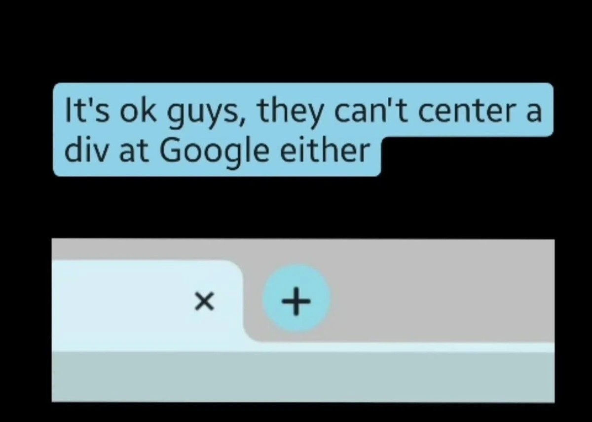
Level 1: The Crooked Sticker
This is funny because everyone has struggled to put something exactly in the middle, and the meme says even Google has trouble with it. It is like carefully placing a sticker on a notebook, measuring it, and still having everyone say it looks crooked. The comfort is that if the giant professional notebook factory also gets a sticker slightly wrong, maybe your crooked sticker is not the end of the world.
Level 2: Center Is Complicated
In web development, a div is a generic rectangular container. New developers often hear jokes about "centering a div" because it sounds easy but used to be surprisingly annoying, especially before modern layout tools became common.
CSS controls how web pages look. Flexbox and CSS Grid are CSS layout systems that make alignment easier. With Flexbox, for example, a developer can center content with properties like justify-content: center and align-items: center. With Grid, they can place items into rows and columns and center them inside grid areas.
The image is funny because it points at a big company and says, in effect, "Even they have the same tiny UI problems." The plus button might be technically centered by the code, but it appears visually awkward in the screenshot. That difference matters in UI design: users judge what they see, not what the layout math says.
Level 3: Pixel Sniping Therapy
The meme's text says:
It's ok guys, they can't center a div at Google either
Below it, a cropped browser toolbar shows a tab close x and a blue circular + button that looks visually off inside the gray strip. The joke is built on a very old frontend wound: centering things in CSS became a running gag because, for years, "put this box in the middle" depended on which kind of middle you meant. Horizontal center? Vertical center? Center inside the parent? Center relative to line height? Center after transforms, zoom, border radius, device pixel ratio, and platform rendering? Congratulations, the div has joined a committee.
The Google angle makes the joke comforting. If a polished product from an elite engineering organization can still contain a visible alignment oddity, then maybe the rest of us are not uniquely incompetent. UI work is full of these tiny traps because visual centering is not always the same as mathematical centering. Icons have optical weight. Circles, plus signs, tab shapes, hit targets, anti-aliased edges, and browser chrome all compete for the user's eye. The button may be centered in its actual bounding box and still look wrong relative to the curved tab edge or toolbar baseline.
The post message adds an excellent layer of UX satire: maybe the asymmetry is "design philosophy" that drives attention and makes users click the new tab button more often. That sounds ridiculous because it is exactly the kind of post-hoc explanation design teams sometimes invent when a pixel-level issue survives review. Every frontend developer has seen a bug turn into "intentional hierarchy" after the deadline. Somewhere a Figma comment thread is becoming a product principle in real time.
This is also why CSS, Flexbox, and CSS Grid did not eliminate layout pain. They made alignment far more sane than the table-layout and float eras, but they did not remove ambiguity from human perception. A layout engine can compute align-items: center; it cannot guarantee that a screenshot on social media will not make the result look like it was nudged by someone using a trackpad during turbulence.
The plus button is probably centered in six nested coordinate systems, just not the one humans look at.
actually, this one is on purpose
either you'd need to give the button equal amounts of margin at the top AND bottom, which would look weird, or you'd need to have the x and the + at different heights, which would look weird, or, this solution, you just nudge the button slightly up, so it's almost aligned with the tab top, but not too far up to make the + visible misaligned (I promise you don't notice it when it's not zoomed in)
Why is this picture a link and how to do that on telegram?
Guys, lets finally decide that this part of Google is stupid and go home
Meta: consistently fails in every single aspect, releasing products inferior to pre-alpha versions. Everyone: Acceptable. Google: positions a picture a few pixels lower than expected. Everyone: !!!
Why tf did they added an extra top padding?
Vertical tabs in Brave or Vivaldi rulez. Almost full name instead of somewhat useless icons.