
Earth's rebrand: now with less information
Description
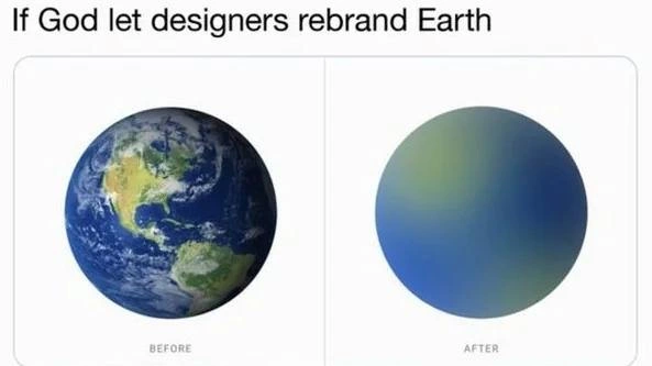
A two-panel meme with the caption 'If God let designers rebrand Earth'. The left panel, labeled 'BEFORE', displays a detailed, realistic photograph of the planet Earth as seen from space, showing the continents of North and South America, deep blue oceans, and swirling white clouds. The right panel, labeled 'AFTER', shows a perfectly smooth sphere with a soft, minimalist gradient that transitions from a muted green at the top to a royal blue at the bottom. This 'rebranded' Earth is devoid of any features, textures, or details. The meme satirizes the corporate and tech industry trend of minimalist design, where complex and detailed logos or interfaces are often 'simplified' into generic, abstract gradients and shapes. For experienced developers, this is a relatable critique of UI/UX redesigns that prioritize a trendy, 'clean' aesthetic over information density and functionality, often resulting in a less usable product



Comments
22Comment deleted
Earth v2.0: a breaking change that removes the 'continents' feature entirely. The documentation just says the new design is 'more intuitive.'
Classic redesign playbook: delete a few continents, ship the gradient, and call it an MVP - just don’t ask the GIS microservice where to put California now
Just like how we went from detailed skeuomorphic interfaces to flat design that users can't distinguish buttons from labels, Earth 2.0 ships with zero affordances - good luck finding your continent when everything is just a smooth gradient. At least the bundle size is smaller and it renders at 60fps on all devices
This perfectly captures the modern design philosophy: take something with rich, complex information architecture and reduce it to a gradient that looks great in a portfolio but tells you absolutely nothing. It's the visual equivalent of replacing your entire monitoring dashboard with a single green circle that says 'System: Good' - technically minimalist, aesthetically pleasing, and completely useless when you actually need to debug production at 3 AM
Classic visual refresh: swapped geography for a CSS radial-gradient and a design token - OKRs green, WCAG red, and every GIS integration just hit a breaking change
Classic rebrand: continents deprecated as ‘visual noise’ and replaced by design tokens planet.primary and planet.accent - looks great until your routing algorithm returns “blue” for every destination
Earth's continents deprecated for viewport scalability - now renders at 60fps on any device
This is how it will look like after AI nukes the planet. Comment deleted
if earth was a japanese... uh... Comment deleted
Ugh, a gradient, too complicated. Make it two tones. Blue and green 👍 Comment deleted
color ramp : linear❌ constant✅ Comment deleted
"DEI here. That excludes africa and the middle east and The arctic" /s Comment deleted
I like gpt suggestion more Comment deleted
why letter? Comment deleted
Because murrica Comment deleted
more like this imo, but with better colors Comment deleted
make an image/svg+xml with $\left|x\right|\le\left|y\right|\left\{x^{2}+y^{2}\le1\right\}$ being green and $\left|y\right|\le\left|x\right|\left\{x^{2}+y^{2}\le1\right\}$ being blue Comment deleted
you couldve used css of tikz Comment deleted
then i converted resulting svg to base64, from which i've made a data: URI, which i opened and screenshoted that to get this image 👍 Comment deleted
Must be a true sw engineer, severely overcomplicating everything Comment deleted
Meanwhile at Google... Comment deleted
Round pizza theory Comment deleted