
Paddington 2: A CSS Padding Story
Description
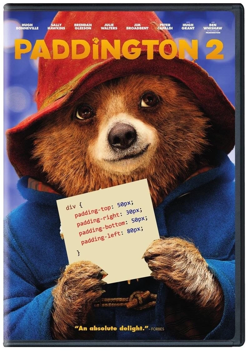
This image is a parody of the movie poster for 'Paddington 2'. It features the main character, Paddington Bear, wearing his classic red hat and blue duffle coat, holding up a small, light-yellow piece of paper. Instead of a personal note, the paper displays a snippet of CSS code: 'div { padding-top: 50px; padding-right: 30px; padding-bottom: 50px; padding-left: 80px; }'. The movie title and cast are visible at the top, and a review quote, '"An absolute delight." -FORBES', is at the bottom. The humor is a direct pun on the character's name, 'Paddington', and the CSS 'padding' property, which is fundamental for controlling layout and spacing in web design. It's a classic example of a developer 'dad joke', appreciated for its simplicity and the clever merging of pop culture with a core web development concept

Comments
8Comment deleted
I showed this to a designer and they said the padding values were all wrong. They'd prefer something more consistent, like 'padding: marmalade;'
Paddington 2: the gritty sequel where the design system is “8-point everywhere” - yet that rogue 30 px right padding keeps shipping to prod and haunting every retro
Finally, a sequel where the protagonist spends 90 minutes trying to center himself vertically while everyone insists flexbox would've been easier
Four longhand declarations instead of 'padding: 50px 30px 50px 80px' - Paddington is polite, but his CSS would never survive the linter
When your PM asks why the layout looks off and you realize you've been setting padding values as inconsistently as Paddington's marmalade sandwich distribution - 80px on the left because that's where you started debugging at 2 AM, and somehow it shipped to production. At least the box model is more forgiving than your CSS linter
Paddington 2: when the movie poster practically begs you to replace padding-left/right with padding-inline and design tokens - before the Arabic launch turns the bear into a localization bug
Paddington: the only dev achieving perfect symmetry without flexbox hacks or viewport tantrums
Great sequel, but my PR comment would be: refactor to padding: 50px 30px 50px 80px; and put it behind a spacing token - maintaining Padding‑tons doesn’t scale