
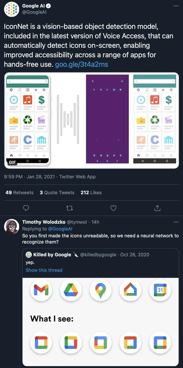
Google's AI solves the icon readability problem it created
Description
This image is a screenshot of a Twitter thread, starting with a post from the official Google AI account. The Google AI tweet announces IconNet, a vision-based model for detecting on-screen icons to improve accessibility. Below this, a user named Timothy Wolodzko replies, 'So you first made the icons unreadable, so we need a neural network to recognize them?'. This is followed by a reply from the 'Killed by Google' account showing a previous tweet that compares Google's old, distinct app icons (like Gmail, Drive, Maps) with their newer, redesigned icons that are all visually similar, multi-colored outlines. The joke is a sharp critique of Google's design philosophy, where they homogenized their icons to the point of being hard to distinguish, and then celebrated a complex AI solution to fix the very accessibility problem they introduced. For senior engineers, this is a classic example of a large corporation creating a problem through a design decision and then over-engineering a technical solution, rather than addressing the flawed design itself
Comments
7Comment deleted
Some call it 'creating a solution.' We call it 'billable hours to fix the design team's branding exercise.'
IconNet: because branding collapsed every app into the same four-color hash collision, so engineering spun up a TPU fleet to run a CNN as a glorified Ctrl-F for the home screen
Google's engineering excellence: spending millions on neural networks to distinguish between icons that a $50K/year designer made indistinguishable. It's like implementing quantum computing to solve a problem you created by removing all the labels from your server room
The pinnacle of modern engineering: training a neural network to solve the icon recognition problem your design team created by making all icons look identical. It's like Google built a complex ML pipeline to reverse-engineer their own design system's accessibility regression - a perfect O(n²) solution to an O(1) problem. Next up: an LLM to interpret their own documentation after they rewrote it to be 'more concise.'
Brand unification made every app a four-color G; IconNet exists so Voice Access can tell them apart - my favorite pattern: converting UX debt into GPU spend
Compress icon entropy with a brand refresh, then decode it with a CNN - lossy UI, lossless MLOps
Google icons: So abstract they bypassed human vision straight to fine-tuned object detection - entropy optimized for TPUs