
DataVisualization Post #7139 · source on Telegram
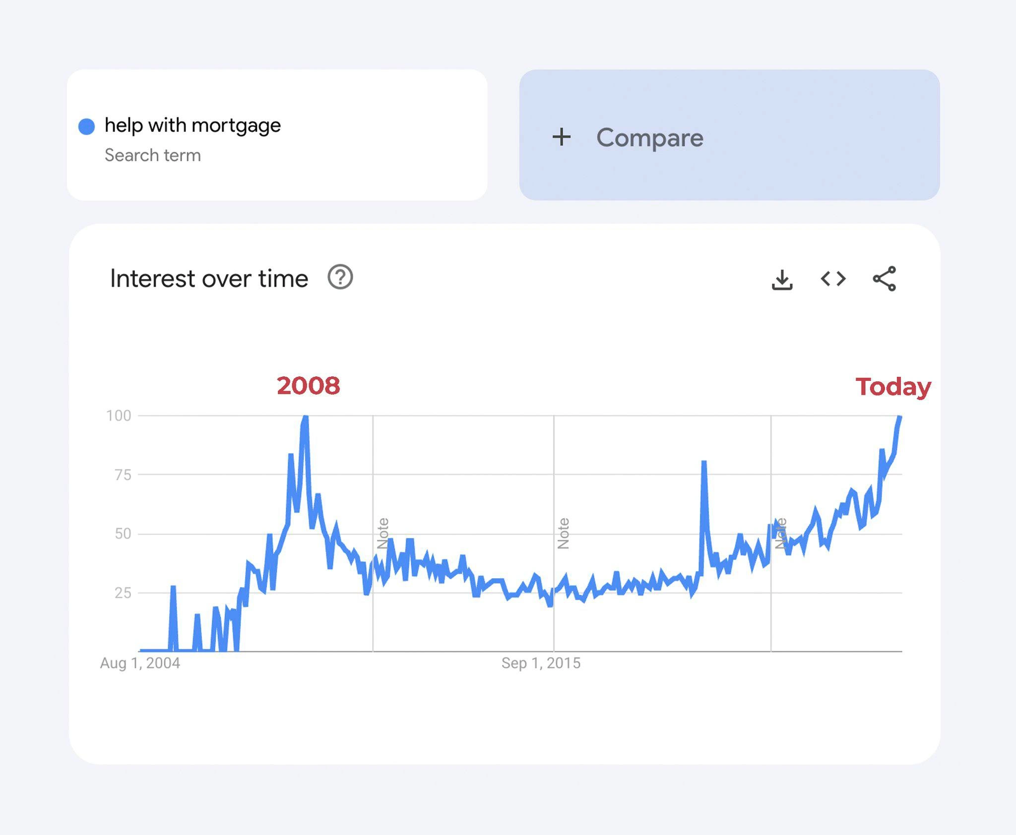
Google Trends Shows Help With Mortgage Searches Hitting 2008 Crisis Levels
Description
A Google Trends chart showing the search term 'help with mortgage' over time from August 1, 2004 to present. The 'Interest over time' graph shows a massive spike around 2008 (labeled in red as '2008') corresponding to the financial crisis, followed by years of relatively low search volume. The chart then shows current search interest surging to match or exceed the 2008 peak (labeled in red as 'Today'). The Compare button and download/embed/share icons are visible. This data visualization implies that mortgage distress is reaching 2008 financial crisis levels, a deeply concerning economic indicator
More like this
More like this in DataVisualization →

Use J and K for navigation
Comments
17Comment deleted
When your Google Trends chart starts looking like your production error rate graph, it's time to update both your resume and your mortgage broker's contact info
That's the original hockey-stick growth chart every founder wants to show investors, but for public anxiety
Looks like the "help with mortgage" metric just breached its 2008 ceiling - turns out exponential backoff is great for retries, not for interest rates
The only thing more predictable than a memory leak in production is developers googling 'help with mortgage' every time their startup's burn rate meets reality - though at least in 2008 we could blame subprime lending instead of subprime architecture decisions
When your production monitoring dashboard and Google Trends for 'help with mortgage' show the same alarming spike pattern, you know it's time to update your resume AND refinance. The 2008 peak was the original 'this is fine' meme for homeowners, and here we are again watching that line go vertical like an unoptimized database query hitting production. At least with technical debt you can refactor - with actual debt, you just get to watch the graph climb while your equity disappears faster than a startup's runway after their Series A falls through
Just like a legacy service dormant for 16 years, then spiking to 100% CPU right when you're on-call
When the 'help with mortgage' panel hits 100, you realize Google re-baselines but salary bands don’t - the only SEV-1 your observability stack can’t auto-remediate
When your personal finance dashboard breaches the 2008 p99, you open a SEV‑1, page the Fed as on‑call, and pray the rollback isn’t ‘variable-rate.’
It's particularly funny to measure interest over time for a loan. And see it hit 100) Comment deleted
And one more piece: https://www.currentmarketvaluation.com/models/price-earnings.php Comment deleted
"uh oh" Comment deleted
What country is it — Zimbabwe? Comment deleted
I could be wrong, but it could also be because of far more people searching on google for such queries now than in 2008, thanks to smartphones being more widespread. Comment deleted
That's literally what Google Trends tracks. Comment deleted
Oh, I should have elaborated: probably because of more widespread internet usage at any given moment (especially due to smartphones). Comment deleted
Smartphones have been widespread since early 10s. By mid 10s everyone and their dog were permanently connected to the internet. The graph reflects the shit economy we're in, not the internet usage. Comment deleted
Edited it to reflect that Comment deleted