
DataVisualization Post #2220 · source on Telegram
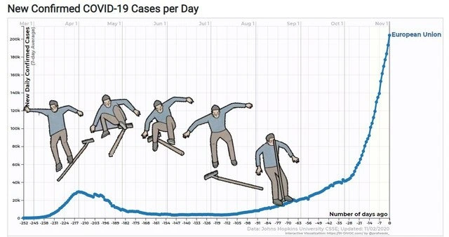
Flattening The Curve, Literally
Description
The image shows a line chart titled "New Confirmed COVID-19 Cases per Day," with the y-axis labeled "New Daily Confirmed Cases" and the x-axis labeled "Number of days ago." A blue time-series line labeled "European Union" dips, rises, and then climbs steeply toward the right edge, with small text at the bottom indicating Johns Hopkins University CSSE data updated on 11/02/2020. Several illustrated skateboarders are pasted onto different slopes of the curve, treating the epidemiological trend line as a skate park. The meme turns pandemic data visualization and prediction into a literal "flatten the curve" joke, while the caption frames it as what happens when machine learning is applied naively to infection-rate forecasting.
More like this
More like this in DataVisualization →

Use J and K for navigation
Comments
7Comment deleted
The model did not flatten the curve; it just discovered Tony Hawk as a feature engineer.
At least we had a bit of time to beef up healthcare capacity.. Right? Comment deleted
Yeah, sure. Spend the COVID budget to fix some roads and give more money to police. (Greetings from Ukraine) Comment deleted
not funny at all Comment deleted
true Comment deleted
According to prediction, we're all gonna die Comment deleted
Well, just remember that over the same period of time, more people will die because the flue than because of covid-19. Comment deleted