
Vague Requirements Free Rein Meme Explained
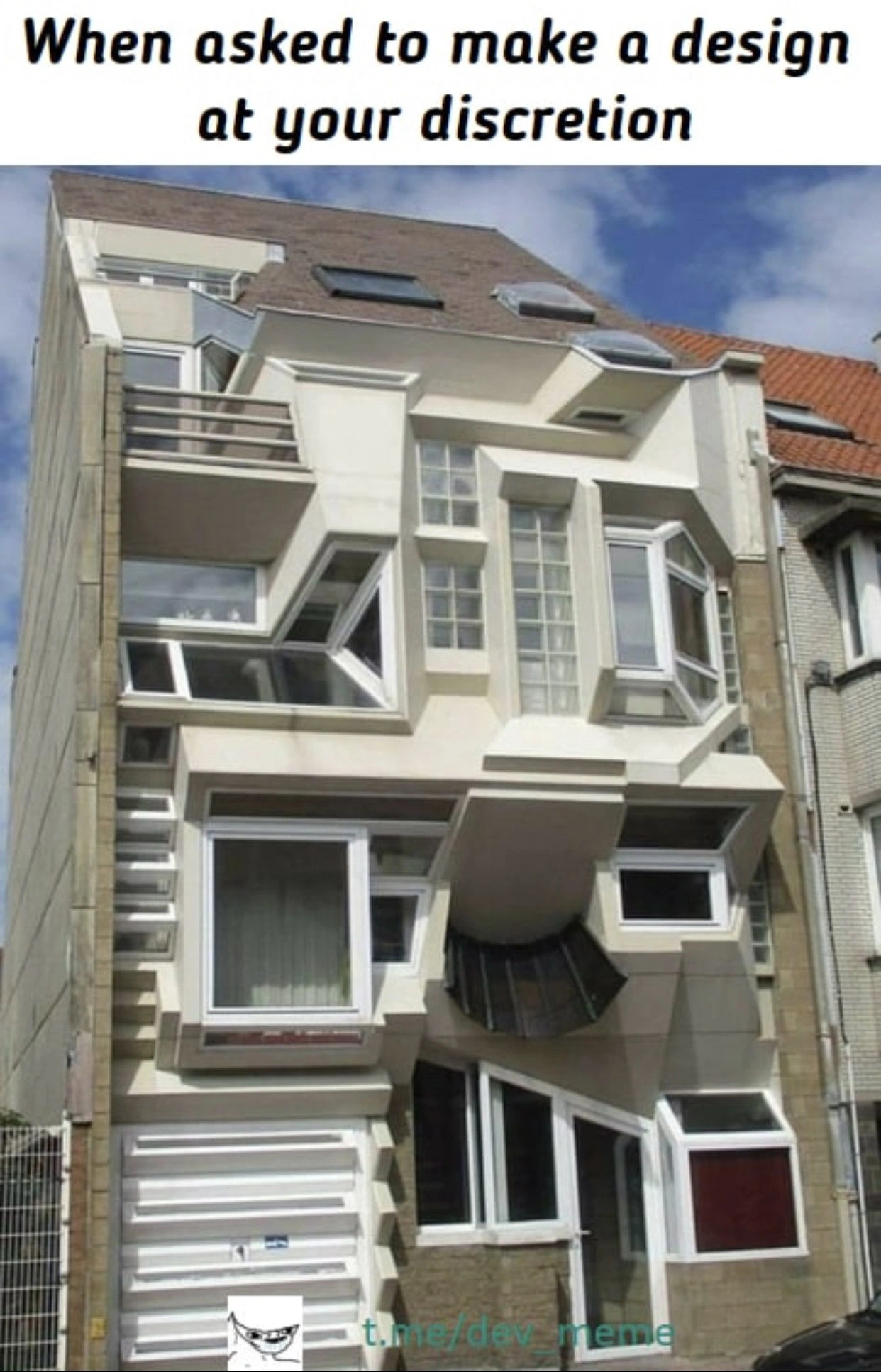
A house of jutting boxes and sideways windows stands in for free-rein design. The dive maps that chaos to requirements ambiguity, misaligned stakeholders, and why specs and design reviews exist.
Level 1: Be Careful What You Wish For
Imagine your friend asks you to make a sandwich and says, "Make it however you want, I’ll eat anything!" You, being super creative, decide to put pepperoni, peanut butter, pickles, and chocolate all together because hey, they said “however you want.” You proudly give this wild sandwich to your friend. The moment they see (or taste) it, they freak out: "Uh, not like that!" It’s funny because your friend’s request was too general, and you took it very literally. They expected something normal, but since they didn’t say it, you went crazy with the idea. This meme is the same joke in a building form: the client said “design it however you want,” and the designer really did whatever – ending up with a crazy-looking house. It teaches us that when we don’t say what we really want, we might get a big surprise!
Level 2: No Requirements, No Rules
Let’s break down what’s happening here in simpler terms. The image shows a house that looks completely crazy – windows at weird angles, boxes sticking out everywhere. In the caption, a client or stakeholder told the designer "design it however you want." That means the person building it had no clear instructions or requirements. In software development, requirements are the guidelines for what the product should do and look like. RequirementsAmbiguity or unclear requirements is when those guidelines are vague or missing, just like in this scenario.
So, what did the builder (or developer) do? They took total creative freedom and ran wild. Every part of the house was designed independently, without any unifying plan – this is why it looks like a patchwork of random ideas. In programming, we have something called design patterns and architecture principles – these are like templates or best practices on how to organize a project so it’s maintainable and user-friendly. If a team ignores common design patterns or doesn’t agree on one architecture, the software can end up inconsistent and confusing (just like this building has no consistent style). For example, imagine a team where one developer likes rounded buttons, another likes square ones, a third uses purple for headings, and a fourth uses green – the app would feel all over the place. That’s basically what's happened to this house visually. It's a bunch of design tradeoffs made without coordination: one window might be great for lighting, another structure might look artsy, but together it clashes.
Now, think about UX/UI (User Experience/User Interface) – these are about how a product looks and feels to a user. A key part of UX is meeting user expectations. If users expect windows to be upright and floors to be flat, this building fails the UX test badly! In a software sense, if users expect a save button to be in the top right and colored blue (because that’s common), but your design puts a floppy disk icon at the bottom left with no label (because you felt creative), users will be confused or frustrated. That’s a UXFailure. The meme is essentially showing a huge UX failure caused by RequirementsUncertainty. The client didn’t specify what they wanted, so the designer did something unconventional that probably misaligned expectations – the end-users (or the client, seeing it built) are likely shocked.
For junior developers or designers, there’s a big lesson here: when someone says “do whatever you think is best,” it’s not a free pass to ignore all norms or skip asking questions. It’s actually a hint that you need to clarify the requirements. Always try to get some direction or at least share a rough idea before going off the deep end. Early in your career, you might have a small project where the teacher or boss is hands-off. If you take that opportunity to try every fancy trick you know (because hey, no one stopped you!), you might end up with something impressive to you but confusing to everyone else. It’s like writing a code algorithm that’s super clever but nobody on your team can understand it – technically it works, but it’s a maintenance headache and not what was needed.
In summary, this meme highlights a common situation: miscommunication with clients. Stakeholders/clients (the people who want the project done) sometimes aren’t specific. Maybe they say things like “make it modern” or “I trust your judgment.” Without more info, a developer might fill in blanks incorrectly. The house image is an extreme, funny example of what filling in the blanks looks like: a house that follows zero normal rules. It’s humor with a bite of truth – misaligned expectations lead to rework and facepalms. So as a best practice: nail down those requirements (even if they say you have free choice, try to get examples of what they consider good), use consistent design patterns so the whole project feels cohesive, and check in with clients often. Otherwise, you might deliver a project and hear, “Uh… this isn’t what we expected at all,” just like a client would react seeing this bizarro house.
Level 3: Chaos by Design
At first glance, this absurd building is a literal architecture anti-pattern – it's what happens when no clear blueprint or design guidelines are in place. In software terms, this house is the frontend equivalent of a "big ball of mud" system: every window, balcony, and beam follows a different pattern (or lack thereof). The meme is poking fun at those times when a developer or designer is given free rein without constraints. The client says "design it however you want" – effectively inviting RequirementsAmbiguity. And guess what? You get a result just as disjointed as this facade.
In a seasoned developer's eyes, the humor cuts deep because we've all witnessed projects with unclear requirements. Maybe a stakeholder told the team, "We trust your expertise, just make it cool," and the team went wild implementing a quirky solution no one asked for. The result? A product as user-friendly as a maze and as consistent as an Escher painting. This wonky house mirrors MisalignedExpectations in software projects: the client envisioned something (they always do, even if they can't articulate it), but the devs built something completely different – technically correct by spec (since there was no spec) but practically all wrong. It's a UX/UI nightmare given physical form – every "feature" of the house (read: every oddly angled window) solves a different hypothetical problem that no real user had.
From a senior perspective, the meme highlights the irony and pain of RequirementsUncertainty. Without a clear target, developers often fill in the blanks based on personal preference, resulting in a jumble of features that don't mesh. In architecture (both building and software), consistency and planning are key. Letting each part be designed in isolation "at your discretion" leads to a system with as much cohesion as this building's facade. It's funny because it's true – we've seen UIs where every page looks like it was designed by a different person on a different planet. No style guide, no shared vision, just a patchwork of ideas. The DesignTradeoffs here were made in a vacuum: one window juts out for more light, another tilts for style – but together, it's a structural mess. Likewise, a codebase where one module is in React, another in Angular, and a third in vanilla JS because each dev did "whatever" becomes an architecture tradeoff disaster.
There's also a cautionary tale about client communication. Experienced devs know that "design whatever you think is best" can be a trap. Often, stakeholders do have preferences and UserExpectations, but they either don't communicate them or don't know how. When those finally surface (usually in a demo or delivery meeting), it's like the client seeing this crazy house for the first time: "Wait... that's not what we meant at all!" Suddenly the freedom turns into blame: "Why would you design it like that?" It's darkly humorous because the developer literally did what was asked – and still got it wrong. In real projects, this leads to frantic refactoring or redesigns, long meetings to realign on requirements, and sometimes the dreaded realization that the team built the wrong thing. The meme exaggerates it to an impossible construction, but every senior dev has lived a smaller-scale version: implementing features or interfaces with too much creative interpretation and then watching the client recoil.
Ultimately, "design by chaos" is an anti-pattern both in building architecture and software. The joke lands for seasoned folks because it's a reminder: clear requirements and alignment might be tedious, but the alternative is literally a house with sideways windows – a product nobody can use as intended. We laugh, a bit nervously, because we’ve all walked on the wild side of discretionary_design and paid the price in late-stage reworks. This meme is a monument (an actual concrete one!) to why we have design reviews, UX guidelines, code standards, and client sign-offs. Without them, you get pure, unhinged developer creativity – amusing to look at, but a nightmare to live in.

Micro-frontends after a year of ‘total dev autonomy’: every window a different framework, all cantilevered off one load-bearing TODO in main
This is what happens when the architect uses the same design pattern we use for microservices - every component doing its own thing with no coordination, eventual consistency be damned, and the facade layer trying desperately to make it all look intentional
This is what happens when the product owner says 'just make it work' without acceptance criteria, the architect is on vacation, and you're given admin access to production. Every window is a different microservice, each balcony represents a separate team's interpretation of the requirements, and that roof? That's the technical debt we'll 'fix in the next sprint.' At least it compiles... structurally speaking
This is what you get when every squad ships its own micro‑frontend with absolute positioning and no design system - eventually consistent windows, zero agreed‑upon door
“At your discretion” architecture: one giant Facade with fourteen inconsistent windows, two write-only ports, and a door implemented as a Kafka topic - great until you discover leaving requires a saga
Full discretion in architecture: the CAP theorem equivalent - pick two: plumb, square, or habitable
It needs glitches
im almost sure that the joke is that from some point of view this house looks okay'ish
когда UI на бутстрапе)
But that was not question for you. :)
ahahha
Old
WTF
Ban him first and ban me
bro
what... did the architect smoke?
thank god i'm not moskal' glory to ukraine glory to heroes