
Chrome UI Golden Ratio Design Meme Explained
A diagram claims classic Chrome chrome heights follow the golden ratio. The article jokes that utilitarian tabs and address bars are cast as sacred geometry, while real UI usually comes from constraints, iteration, and compromise—not pure φ.
Level 1: The Fancy Ruler
Imagine someone looks at a messy desk and says, "Actually, every pencil, cup, and notebook is placed according to a secret perfect pattern." That is funny because it makes an ordinary thing sound magically planned. This meme does the same with an old web browser: it acts like the tabs and buttons were arranged by a beautiful math rule, even though they probably just needed to fit on the screen and look usable.
Level 2: Phi Meets Pixels
The golden ratio is a mathematical proportion often approximated as 1.618. It is commonly represented by the Greek letter φ, called phi. Designers sometimes reference it when talking about pleasing proportions in rectangles, layouts, typography, or spacing. In practice, modern UI design usually depends more on consistency, usability, accessibility, and clear visual hierarchy than on any single magic number.
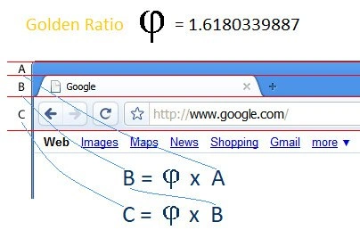
The image shows a browser interface divided into measured horizontal bands:
Amarks the top strip around the tab area.Bmarks the next band around the address and browser controls.Cmarks the band above the page content and link row.B = φ x AandC = φ x Bclaim those bands scale by the golden ratio.
Browser chrome means the browser's own interface around the webpage: tabs, back and forward buttons, refresh, the address bar, bookmarks, menus, and toolbars. It is called "chrome" because it is the frame around the actual content, not the content itself. In this meme, the browser chrome is being analyzed like a carefully proportioned artwork.
For frontend and UX developers, the humor is familiar because design explanations can become oddly ceremonial. A spacing choice that began as "this looked better after moving it down" may later be described as a principled system. That does not mean design systems are fake; good spacing systems are valuable. The joke is the overconfidence of treating every pixel as if it came from ancient mathematics rather than iteration, compromise, and browser quirks.
Level 3: Sacred Browser Chrome
The image turns an ordinary old Chrome browser window into a miniature Renaissance design proof. It labels the toolbar bands A, B, and C, draws red measurement guides, overlays a blue curve, and states:
Golden Ratio φ = 1.6180339887
Below the browser controls, it adds the formulas:
B = φ x A
C = φ x B
The joke is not just "math on a screenshot." It is the exaggerated seriousness of applying golden-ratio mystique to browser chrome: tabs, address bar, navigation buttons, and the row of Google links like Web, Images, Maps, News, Shopping, and Gmail. These are utilitarian UI elements, the kind of surfaces that normally emerge from product constraints, pixel grids, branding, accessibility requirements, operating-system conventions, and many rounds of "can we make that three pixels tighter?"
By presenting those heights as a clean proportional system, the meme satirizes the design habit of retroactively discovering elegance in messy artifacts. UI design often does use ratios, spacing scales, rhythm, and hierarchy. But production interfaces rarely descend from pure geometry like a cathedral blueprint. They are negotiated into existence by browser compatibility, localization, toolbar density, touch targets, extension icons, product politics, and the fact that somebody in a review meeting disliked how the tab looked next to the favicon.
That is why the old Chrome screenshot matters. Browser interface design is extremely constrained: tabs must be clickable, the address field must be readable, navigation controls must be recognizable, and the content area must start quickly enough that the browser does not feel like it is eating the page. If the old layout happened to line up with a golden-ratio diagram, the funny part is how satisfying that looks compared with the actual reality of frontend and product design. Developers know the more likely process involved bug trackers, screenshots, platform-specific polish, and one designer with a ruler fighting the good fight.
There is also a subtle nostalgia layer. The visible UI has older Chrome styling: compact tabs, a classic address bar, and old Google navigation links. Applying a grand mathematical frame to it gives a mundane piece of web development history an absurdly noble origin story. Apparently the browser toolbar was not merely a toolbar; it was an irrational number wearing a favicon.



Finally, proof that browser toolbar height was not arbitrary; it was just product management discovering irrational numbers.
A is absolutely useless and prevents from closing tabs quickly
A does not exist... also B = C
and there's a D which = C and B
Chrome tab design used my Ram
Yes